
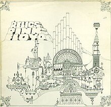
 The golden spiral theory has been applied to this album cover, as the eye is first drawn to the header in the left hand corner and then spirals down and across over the image. The album title and the band name are placed next to each other, suggesting that they are of equal importance. The colour scheme is very dark, but is contrasted by the light blue text, thus making the important information stand out. The original art (above, right) was designed by drummer Nick Mason, and was inspired by his time studying architecture. However, Storm Thorgerson created a new cover (above, left) for the 1996 re-release, photographing a model inspired by the original line drawing. Neither bear any relation to the band or the album, once again, but are very eye-catching and abstract in their design, attracting the target audience to the music.
The back cover (right) relating to the newer artwork is very similar to the front cover, in that it uses the same colour scheme and images, although the blues are intensified slightly and the image of the model has been scaled down. The way the barcode has been positioned is slightly odd, as it is on its side and looks quite out of place.
 The digipak artwork (left) repeats the cover image throughout, although sometimes capturing the model from a different angle and changing the effects added (the panel on the left is darker than the others and looks slightly grey, whereas the panel on the right has a black border and the image is gold). The colour scheme is primarily blue, black and gold, although the booklet is a richer purple on some pages, reflecting elements of psychedelia and grunge.
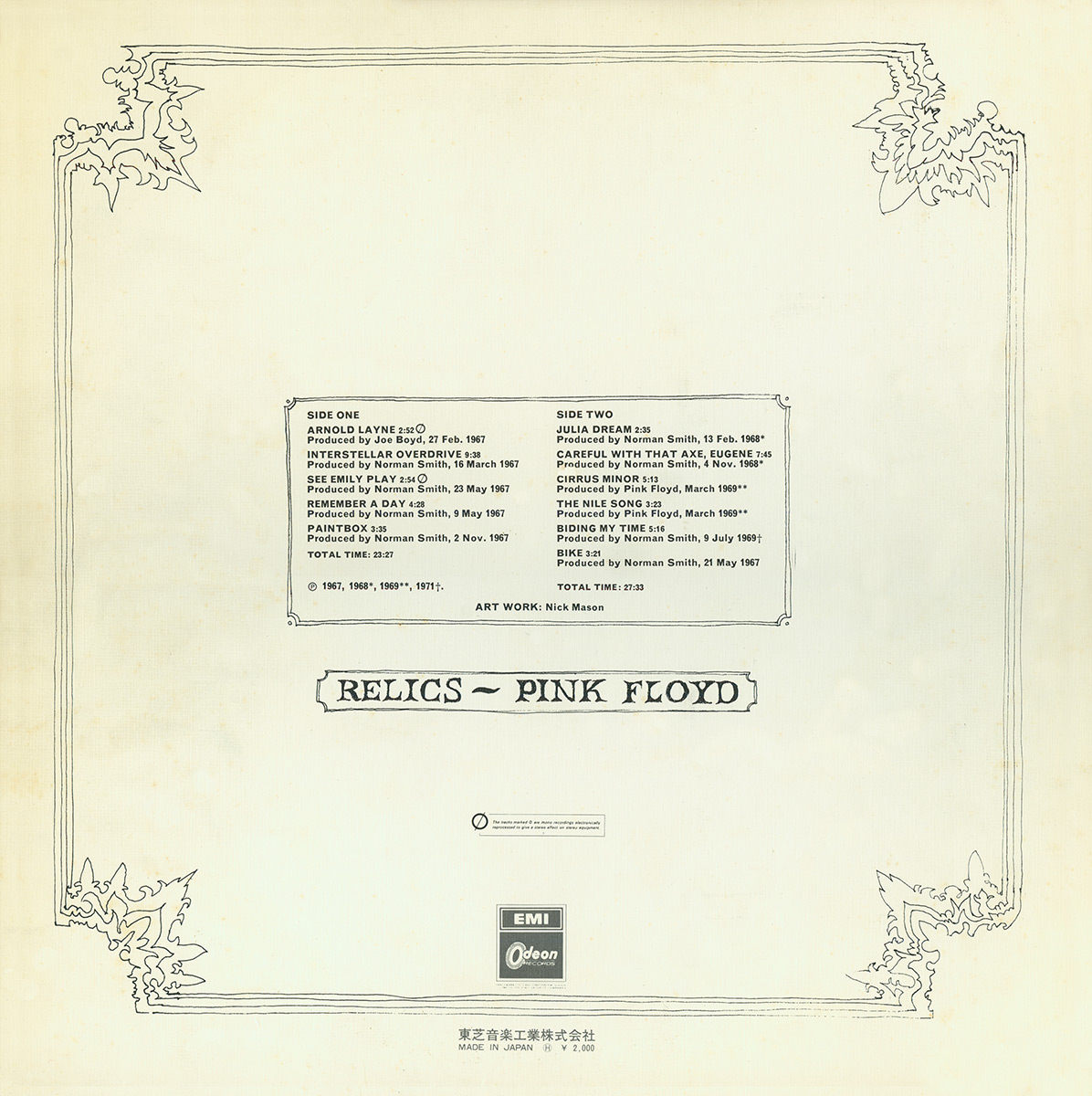
I have found different back covers belonging to the original drawn artwork (below), each of which are incredible minimalistic and bare, sticking to a plain, black and white colour scheme and abandoning the previous outburst of colour used in the pink header. This may have been done to let the music speak for itself, but I much prefer the newer artwork which is much more colourful and attractive.
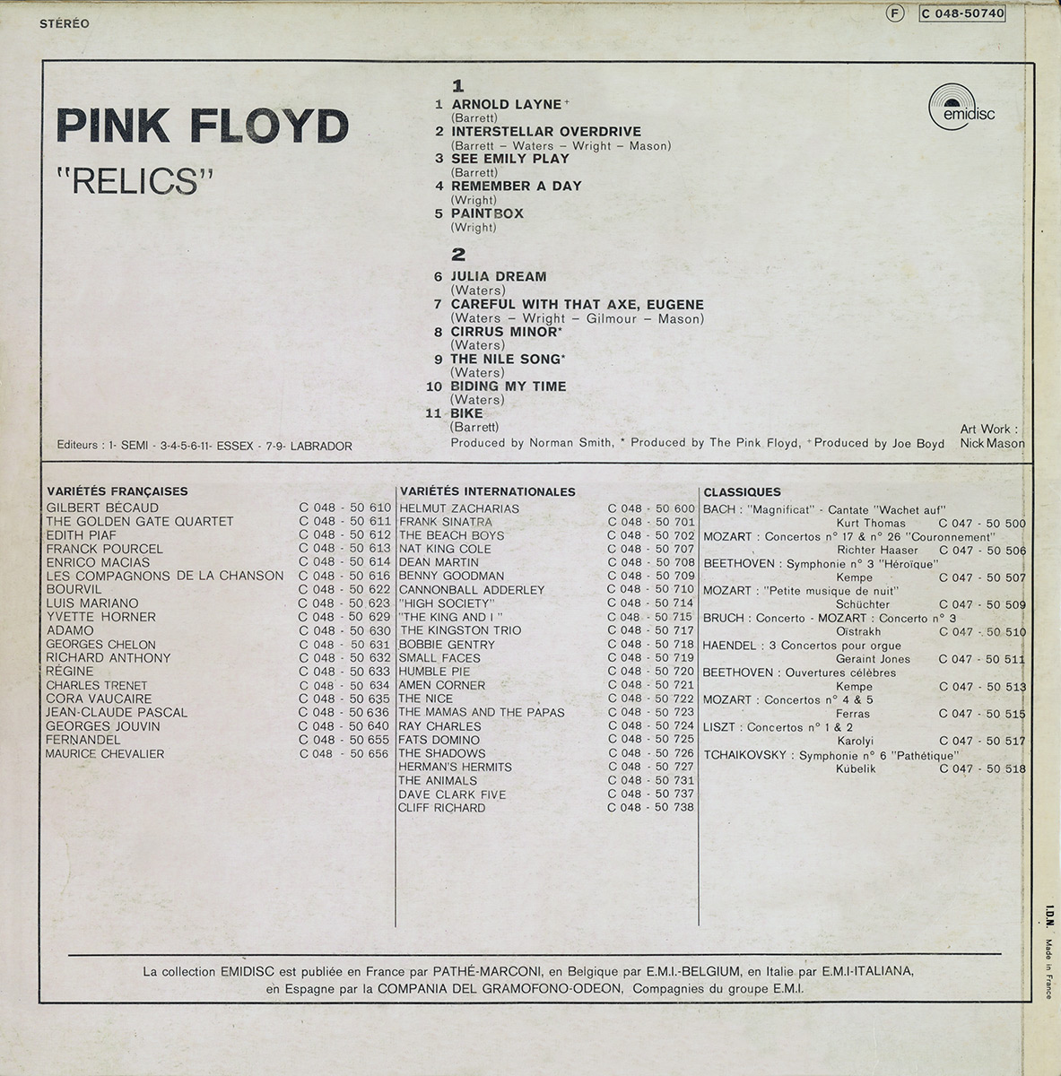
I also found this version of the album artwork (below), which is slightly different in colour to the original but is in keeping with the drawn architectural style. The bold font style is more closely related to the newer artwork, however, and stands out against the grubby, dull looking background. The song titles fill half of the space on the back cover, suggesting that this is the most important information for the audience to receive.

No comments:
Post a Comment