
A2 Media
Thursday, 19 December 2013
Wednesday, 18 December 2013
Alternative Magazine Advert

I have moved the text so that everything is in line, but I am unsure as to which works best.

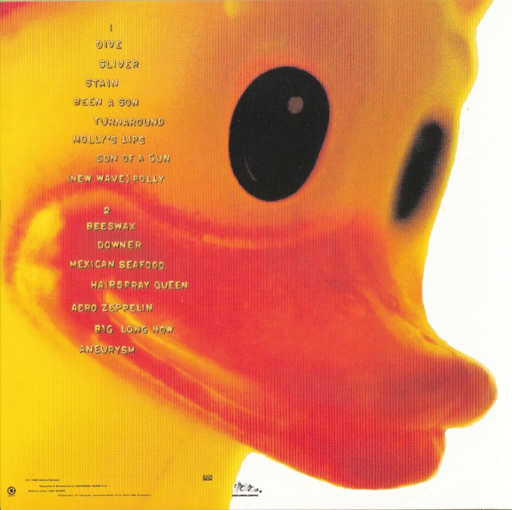
Final Digipak

I did not alter the inside right image as my teacher had approved that this did not need changing, and although he did suggest that I add text to the front cover, I felt that this would ruin the image and after doing so, decided to leave it as it was originally. The back cover, inside left and spine improvements have been stated in previous posts.
Monday, 16 December 2013
Saturday, 14 December 2013
Friday, 13 December 2013

Wednesday, 11 December 2013
Friday, 6 December 2013
Evaluation Question 4 (Draft)
How did you use media technologies in the construction and research, planning and evaluation stages?
During the research and planning stages of the project, the use of technologies, such as the internet, was vital in establishing a clear target audience, finding example texts and gaining inspiration. Without access to the following technologies, the construction process would have also been virtually impossible; not only was the recording equipment a necessity, but the editing software available also acted as a crucial component in the creation of both my main product and the ancillary texts.
YouTube
Access to the internet, and YouTube in particular, helped shape my ideas during the research and planning stages. I began my research by scouring the site for music videos of all genres, so as to gain an insight into the typical conventions used, and then narrowed down the search to alternative rock videos only. I copied the embed codes of the videos I found the most interesting, and captured specific shots using TubeChop which I then pasted into blog posts that I could refer back to during further planning. I also presented my music video in the form of a YouTube upload, as this provided a professional platform to display my work, as well as making my product easily accessible to an audience, through YouTube itself, and by pasting the link into social networking sites and into Blogger to gain feedback.
Blogger
I used Blogger throughout the entirety of the project as a way of tracking my progress and projecting my ideas, whilst gaining feedback in the process and presenting my final products. As previously stated, the HTML section allows the user to embed codes from YouTube which then appear in video format when published, post Scribd documents or simply add text and images through the use of the "compose" tool. Comment boxes are present on each post, thus encouraging audience feedback, and I was also able to embed the band's Twitter feed directly onto the blog itself.
Twitter
I created a Twitter profile for "Electric Addiction" so as to further promote my artist and establish a clear brand name. Twitter was important during the establishment of Electric Addiction's identity, as I was able to directly reach an audience and further portray elements of branding, such as "retweeting" bands of a similar style and genre onto my profile and uploading pictures during my time in the studio - I was able to use the Twitter app to post photos directly from my iPhone, as well as being able to "tweet" whenever I wanted. The platform allowed me to post links which would appear on my followers' timelines, and so by sharing my final video via Twitter, I gained more views and received extra audience feedback.
Animoto
I briefly used Animoto during the planning stages of my work, and used it as a way of visually representing my initial ideas during the construction of my pitch to the class. I was able to add audio to a short presentation consisting of both text and images, which allowed my peers to get a feel for the genre of music I was focusing on, as well as determining whether the style of visuals would work well alongside my chosen song.
Samsung VP-L800U Camcorder
By using the Samsung VP-L800U Camcorder, I was able to create a grainy, noise effect without spending extra time editing the footage. I filmed using the black and white filter which was installed on the camcorder, and then played back the footage and viewed it on the LCD screen. The bulky size but lightweight feel of the camera made filming a lot easier, as I was able to hold and move the camera with both sturdiness and ease.
The downside to using the Samsung was that I couldn't transfer the footage to the iMacs or simply one of the computers. It was impossible to upload the video footage because there were no videos, simply recordings on a tape. I could have converted the tape footage to a disc, but this would have been costly and time-consuming, and so to overcome this problem, I re-shot the footage on the LCD screen using a Panasonic digital camcorder, which could then be transferred onto the iMac. The Panasonic was a useful piece of equipment as I could film each shot separately, gaining individual pieces of footage rather than one continuous shot, as was the case with the Samsung, which played each shot directly after the previous one. I used the tape to my advantage, however; by re-winding and pausing the footage whilst re-filming with the Panasonic, I was able to capture the full effects of an old camcorder whilst viewing the footage on the LCD screen. The new footage shot using the Panasonic displayed the recording time in the corner of the screen and captured the white noise effect of rewinding.
Panasonic HDC-SC80 Full HD Video Camera
The Panasonic digital camcorder I used was a vital piece of equipment during the construction process of my music video, as it captured all of the footage I shot and enabled me to upload this footage to the iMac, which I then edited using Final Cut Pro. The handheld size of the camera meant that I could easily shoot in any location and could create a shaky camera effect easily as it was lightweight and subject to my own movement, rather than being placed still on a tripod for example. The Panasonic enabled me to view each shot separately, thus helping me to distinguish between the good and bad footage before uploading, increasing productivity during the filming process. Both camcorders allowed me to zoom in and out effectively, focusing and framing the shot, and enabled me to add digital effects whilst filming. As well as being able to view the footage whilst it was being shot on the LCD screens, I could also use the flash on the Panasonic to capture well-lit footage regardless of exterior lighting. All in all, this camcorder took a lot of the pressure off my shoulders and allowed for great filming.
Final Cut Pro/Apple iMac
The Final Cut Pro software available on the iMacs at college was essential during the editing process of my music video. Although I had trouble connecting and uploading the footage I had shot using the Samsung camcorder, this problem was easily overcome as I re-shot my footage from the camcorder LCD screen using the Panasonic; I was then able to transfer all of my footage, from both the video camera and the camcorder (though taken also from the Panasonic), to one specific area. I could then view each shot before placing them accordingly in the video timeline, as well as being able to crop the footage to the length I wanted. The programme also allowed me to insert audio clips, and so I was able to place "Where Is My Mind" directly onto the timeline and have it play alongside the footage, thus allowing me to ensure that the lip syncing and performance was timed correctly, and that the visuals reflected the music. Final Cut Pro also enabled me to add a number of digital effects and transitions to my footage, creating smooth cuts between shots and establishing a professional look. The "static" transition, for example, was a recurring effect used throughout my video, as well as the "camcorder" effect which enhanced the aesthetic I'd already created using my own camcorder. The software became a vital editing tool whilst trying to achieve the final 30 seconds (more or less) of my video; in processing my storyboard, I had planned to incorporate a juxtaposition of a mirrored shot and a shot of the vocalist miming, constantly going back and forth and switching between the two, increasing the pace of the editing considerably. Final Cut Pro made the whole process a lot easier; each piece of footage was at hand as they were imported to the software's library, and I was able to use the "zoom" tool to perfectly match up each shot, making each cut precise and seeming to follow on from one another although there was a glitch in between. Prior to this, I used Final Cut Pro to create my animatic; a visual representation of my storyboard presented as a video, with each shot edited in time with the song.
iPhone/Video Star
During the filming process, I not only used camcorders, but also my iPhone, and specifically the app "Video Star". This footage is included towards the end of my video, and was used to further emphasise a state of disorientation as the song reaches its climax. The app allowed me to use a mirror effect which both reflected the image and enhanced the colour saturation, creating a psychedelic and surreal style. Having captured the footage, I was able to upload straight to YouTube from my iPhone. I then pasted the link into Blogger so as to gain audience feedback and present my work, and transferred this onto Final Cut Pro by accessing the link on the iMacs. I also used my iPhone to promote my artist, as previously stated, by uploading photos using the Twitter app.
Adobe Photoshop
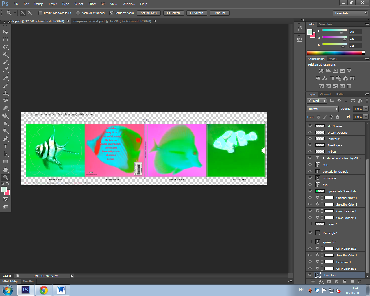
I used Adobe Photoshop during the production of my ancillary texts. The editing software allowed me to create a design for my digipak, and, consequently, a magazine advert. First of all, I imported a digipak template into a blank document, thus setting up the outline for my design. I then viewed my "test shots" video and took screen grabs of certain shots I wanted to incorporate into my digipak. I saved them as pictures and imported them into Photoshop, within the guidelines of the template. Photoshop provided me with access to cropping tools and enabled me to add effects to the graphics, as well as altering the exposure, colour balance and hue/saturation, further enhancing the element of psychedelia throughout my work. Having used Photoshop during the AS course, I had previous knowledge of the programme and decided that it would be the best editing software to use in the construction of my ancillary texts. By creating different layers, both text and images are easy to place and edit, and can also be hidden if need be or deleted altogether without affecting the remaining layers. Having completed the digipak, I then began working on the magazine advert; I created a new document and imported the digipak front cover into the blank space, then added text using the "type" tool. All of the tools available, such as the "grid" tool, proved to be beneficial during the editing process - in this instance, the grid tool allowed me to align text and images, and helped me to establish rules of third and general space awareness. Without the use of this technology, my completed products would not look to such a high standard, and the professionalism of my work would be lost.
During the research and planning stages of the project, the use of technologies, such as the internet, was vital in establishing a clear target audience, finding example texts and gaining inspiration. Without access to the following technologies, the construction process would have also been virtually impossible; not only was the recording equipment a necessity, but the editing software available also acted as a crucial component in the creation of both my main product and the ancillary texts.
YouTube
Access to the internet, and YouTube in particular, helped shape my ideas during the research and planning stages. I began my research by scouring the site for music videos of all genres, so as to gain an insight into the typical conventions used, and then narrowed down the search to alternative rock videos only. I copied the embed codes of the videos I found the most interesting, and captured specific shots using TubeChop which I then pasted into blog posts that I could refer back to during further planning. I also presented my music video in the form of a YouTube upload, as this provided a professional platform to display my work, as well as making my product easily accessible to an audience, through YouTube itself, and by pasting the link into social networking sites and into Blogger to gain feedback.
Blogger
I used Blogger throughout the entirety of the project as a way of tracking my progress and projecting my ideas, whilst gaining feedback in the process and presenting my final products. As previously stated, the HTML section allows the user to embed codes from YouTube which then appear in video format when published, post Scribd documents or simply add text and images through the use of the "compose" tool. Comment boxes are present on each post, thus encouraging audience feedback, and I was also able to embed the band's Twitter feed directly onto the blog itself.
I created a Twitter profile for "Electric Addiction" so as to further promote my artist and establish a clear brand name. Twitter was important during the establishment of Electric Addiction's identity, as I was able to directly reach an audience and further portray elements of branding, such as "retweeting" bands of a similar style and genre onto my profile and uploading pictures during my time in the studio - I was able to use the Twitter app to post photos directly from my iPhone, as well as being able to "tweet" whenever I wanted. The platform allowed me to post links which would appear on my followers' timelines, and so by sharing my final video via Twitter, I gained more views and received extra audience feedback.
Animoto
I briefly used Animoto during the planning stages of my work, and used it as a way of visually representing my initial ideas during the construction of my pitch to the class. I was able to add audio to a short presentation consisting of both text and images, which allowed my peers to get a feel for the genre of music I was focusing on, as well as determining whether the style of visuals would work well alongside my chosen song.
Samsung VP-L800U Camcorder
By using the Samsung VP-L800U Camcorder, I was able to create a grainy, noise effect without spending extra time editing the footage. I filmed using the black and white filter which was installed on the camcorder, and then played back the footage and viewed it on the LCD screen. The bulky size but lightweight feel of the camera made filming a lot easier, as I was able to hold and move the camera with both sturdiness and ease.
The downside to using the Samsung was that I couldn't transfer the footage to the iMacs or simply one of the computers. It was impossible to upload the video footage because there were no videos, simply recordings on a tape. I could have converted the tape footage to a disc, but this would have been costly and time-consuming, and so to overcome this problem, I re-shot the footage on the LCD screen using a Panasonic digital camcorder, which could then be transferred onto the iMac. The Panasonic was a useful piece of equipment as I could film each shot separately, gaining individual pieces of footage rather than one continuous shot, as was the case with the Samsung, which played each shot directly after the previous one. I used the tape to my advantage, however; by re-winding and pausing the footage whilst re-filming with the Panasonic, I was able to capture the full effects of an old camcorder whilst viewing the footage on the LCD screen. The new footage shot using the Panasonic displayed the recording time in the corner of the screen and captured the white noise effect of rewinding.
Panasonic HDC-SC80 Full HD Video Camera
The Panasonic digital camcorder I used was a vital piece of equipment during the construction process of my music video, as it captured all of the footage I shot and enabled me to upload this footage to the iMac, which I then edited using Final Cut Pro. The handheld size of the camera meant that I could easily shoot in any location and could create a shaky camera effect easily as it was lightweight and subject to my own movement, rather than being placed still on a tripod for example. The Panasonic enabled me to view each shot separately, thus helping me to distinguish between the good and bad footage before uploading, increasing productivity during the filming process. Both camcorders allowed me to zoom in and out effectively, focusing and framing the shot, and enabled me to add digital effects whilst filming. As well as being able to view the footage whilst it was being shot on the LCD screens, I could also use the flash on the Panasonic to capture well-lit footage regardless of exterior lighting. All in all, this camcorder took a lot of the pressure off my shoulders and allowed for great filming.
Final Cut Pro/Apple iMac
The Final Cut Pro software available on the iMacs at college was essential during the editing process of my music video. Although I had trouble connecting and uploading the footage I had shot using the Samsung camcorder, this problem was easily overcome as I re-shot my footage from the camcorder LCD screen using the Panasonic; I was then able to transfer all of my footage, from both the video camera and the camcorder (though taken also from the Panasonic), to one specific area. I could then view each shot before placing them accordingly in the video timeline, as well as being able to crop the footage to the length I wanted. The programme also allowed me to insert audio clips, and so I was able to place "Where Is My Mind" directly onto the timeline and have it play alongside the footage, thus allowing me to ensure that the lip syncing and performance was timed correctly, and that the visuals reflected the music. Final Cut Pro also enabled me to add a number of digital effects and transitions to my footage, creating smooth cuts between shots and establishing a professional look. The "static" transition, for example, was a recurring effect used throughout my video, as well as the "camcorder" effect which enhanced the aesthetic I'd already created using my own camcorder. The software became a vital editing tool whilst trying to achieve the final 30 seconds (more or less) of my video; in processing my storyboard, I had planned to incorporate a juxtaposition of a mirrored shot and a shot of the vocalist miming, constantly going back and forth and switching between the two, increasing the pace of the editing considerably. Final Cut Pro made the whole process a lot easier; each piece of footage was at hand as they were imported to the software's library, and I was able to use the "zoom" tool to perfectly match up each shot, making each cut precise and seeming to follow on from one another although there was a glitch in between. Prior to this, I used Final Cut Pro to create my animatic; a visual representation of my storyboard presented as a video, with each shot edited in time with the song.
iPhone/Video Star
During the filming process, I not only used camcorders, but also my iPhone, and specifically the app "Video Star". This footage is included towards the end of my video, and was used to further emphasise a state of disorientation as the song reaches its climax. The app allowed me to use a mirror effect which both reflected the image and enhanced the colour saturation, creating a psychedelic and surreal style. Having captured the footage, I was able to upload straight to YouTube from my iPhone. I then pasted the link into Blogger so as to gain audience feedback and present my work, and transferred this onto Final Cut Pro by accessing the link on the iMacs. I also used my iPhone to promote my artist, as previously stated, by uploading photos using the Twitter app.
Adobe Photoshop
I used Adobe Photoshop during the production of my ancillary texts. The editing software allowed me to create a design for my digipak, and, consequently, a magazine advert. First of all, I imported a digipak template into a blank document, thus setting up the outline for my design. I then viewed my "test shots" video and took screen grabs of certain shots I wanted to incorporate into my digipak. I saved them as pictures and imported them into Photoshop, within the guidelines of the template. Photoshop provided me with access to cropping tools and enabled me to add effects to the graphics, as well as altering the exposure, colour balance and hue/saturation, further enhancing the element of psychedelia throughout my work. Having used Photoshop during the AS course, I had previous knowledge of the programme and decided that it would be the best editing software to use in the construction of my ancillary texts. By creating different layers, both text and images are easy to place and edit, and can also be hidden if need be or deleted altogether without affecting the remaining layers. Having completed the digipak, I then began working on the magazine advert; I created a new document and imported the digipak front cover into the blank space, then added text using the "type" tool. All of the tools available, such as the "grid" tool, proved to be beneficial during the editing process - in this instance, the grid tool allowed me to align text and images, and helped me to establish rules of third and general space awareness. Without the use of this technology, my completed products would not look to such a high standard, and the professionalism of my work would be lost.
Thursday, 5 December 2013
Evaluation Question 3 (Draft)
What have you learned from your audience feedback?
I sought feedback on my work frequently throughout the course of the project, so as to gain advice from both my target audience, consisting of peers and classmates, who's opinions were mainly positive, and from teachers who were more constructive in their criticism. I received feedback through word of mouth, social networking sites such as Twitter, comments on blog posts and written pieces. This was vital in both the research and planning and the production stages of the coursework, as it enabled me to build on my ideas early on and improve each of my media products as I developed my ideas further.
To first gain feedback on the initial concept of my video, I pitched my ideas to my classmates via Animoto. I received positive comments regarding surrealism and abstract shots, as well as my idea of shaky camerawork and disorientated framing (as shown below). My song choice also received praised and I was complimented on the links made between the general aesthetic I wanted to create and the context of the lyrics, as well as the use of black and white shots to differentiate from the fish footage.


I was also praised for having "interesting ideas" which were "different from a lot of people's work", which consequently boosted my confidence and encouraged me to push boundaries further. I was asked, also at this stage, whether I would continue the psychedelic element onto my digipak and magazine advert, in which I replied that I would be, as this element had been discussed with great enthusiasm by my peers.
Although I insinuated that I might be including a narrative element within my video, I quickly established that I simply wanted to draw upon the lyrics of the song, and so decided to incorporate both illustration and amplification instead. Having created an "audience profile" using UK Tribes, concerning my target market, I established that "Young Alts", "Indie Scenesters" and "Leading Edge" tribes were most fitting regarding genre, which reinforced the previous feedback I had been given, as my classmates could be placed into at least one, if not all, of these categories. The process of receiving and interpreting audience feedback at this stage helped to cement my ideas and gave me the "go-ahead" to put them into action. I created a moodboard, a band biography and several posts concerning possible camera styles, as well as filming test shots containing the fish element and deciding on my location. Although I did not receive written feedback on these developments, I was complimented orally by my teacher and my peers, and so began work on my storyboard which combined all of this.
Having submitted a draft music video, I received initial feedback from my teacher, who complimented me on the fish shots and suggested that they feature earlier on in the video too, as well as establishing which features of my video worked well. From a more critical perspective, he noted that the performance element was too weak and the mise-en-scene was "awful" but after watching the video several times it became "strangely appealing". Taking this on board, I organised a re-shoot and instructed my actors of the changes that needed to be made. Although the comments regarding setting were not ultimately negative, I felt that it was best to choose a different location when re-filming. I decided to shoot in another of the rehearsal rooms at Stayfree Music, but one which had plain white walls, as the mise-en-scene in the orange room, due to the obscure wallpaper, was distracting and took away from the band's performance. This decision also improved the quality of the lighting and made the shots clearer.
My teacher's comments were important as they discussed the accuracy and professionalism of my work, but the feedback I received from my peers was ultimately more influential in my decisions as they represented my target audience. The black and white shots were heavily praised (see below), as the camcorder effect "tied in" with this element nicely. Several of my classmates commented on the inadequacy of the location and the clarity of the footage in the orange room, which I then took on board during the re-shoot. There were two contrasting points of view regarding the fish shots; the first was that they were sometimes "not easy to make out" and "a bit blurry", whilst the other expressed that "the fish floating around looks really good". I examined this for myself, focusing on the shots which blended both the fish footage and the black and white shots, rather than the fish footage in its entirety. I concluded that the section which marked the chorus ("where is my mind" x3) did in fact make the fish look slightly faint, in contrast to the bold, abstract colours projected in other shots, and altered the state of the black and white effect; I couldn't retain the colourfulness of the fish whilst keeping the shot black and white, as I had to place both shots over one another and turn down the opacity in order to blend the two together, and so I decided to remove the fish from the shot altogether.


With regards to my ancillary texts, having created a first draft of both a digipak and a magazine advert, I was presented with more feedback from my teacher. He'd annotated my handouts and suggested just a few tweaks were made, as I was awarded 8/10 for both pieces. I altered the layout of my digipak's back cover and placed the text accordingly, as well as replacing the barcode with one which better suited the style, and added further tracking information to the inside left, also changing the font used on the spine, so as to keep a sense a continuity running throughout. I made a few minor alterations to my magazine advert, mainly regarding the layout and positioning of text. The feedback I then received from my peers on my final products suggested that the changes I had made were constructive, and many commented on the effective "branding" I had created in linking my main product with the ancillary texts. The psychedelic colour palette was also well received and I was told that they "complimented each other" well. My chosen layout and fonts were praised, insinuating that the improvements I made to my first drafts were commendatory.


I sought feedback on my work frequently throughout the course of the project, so as to gain advice from both my target audience, consisting of peers and classmates, who's opinions were mainly positive, and from teachers who were more constructive in their criticism. I received feedback through word of mouth, social networking sites such as Twitter, comments on blog posts and written pieces. This was vital in both the research and planning and the production stages of the coursework, as it enabled me to build on my ideas early on and improve each of my media products as I developed my ideas further.
To first gain feedback on the initial concept of my video, I pitched my ideas to my classmates via Animoto. I received positive comments regarding surrealism and abstract shots, as well as my idea of shaky camerawork and disorientated framing (as shown below). My song choice also received praised and I was complimented on the links made between the general aesthetic I wanted to create and the context of the lyrics, as well as the use of black and white shots to differentiate from the fish footage.


I was also praised for having "interesting ideas" which were "different from a lot of people's work", which consequently boosted my confidence and encouraged me to push boundaries further. I was asked, also at this stage, whether I would continue the psychedelic element onto my digipak and magazine advert, in which I replied that I would be, as this element had been discussed with great enthusiasm by my peers.
Although I insinuated that I might be including a narrative element within my video, I quickly established that I simply wanted to draw upon the lyrics of the song, and so decided to incorporate both illustration and amplification instead. Having created an "audience profile" using UK Tribes, concerning my target market, I established that "Young Alts", "Indie Scenesters" and "Leading Edge" tribes were most fitting regarding genre, which reinforced the previous feedback I had been given, as my classmates could be placed into at least one, if not all, of these categories. The process of receiving and interpreting audience feedback at this stage helped to cement my ideas and gave me the "go-ahead" to put them into action. I created a moodboard, a band biography and several posts concerning possible camera styles, as well as filming test shots containing the fish element and deciding on my location. Although I did not receive written feedback on these developments, I was complimented orally by my teacher and my peers, and so began work on my storyboard which combined all of this.
Having submitted a draft music video, I received initial feedback from my teacher, who complimented me on the fish shots and suggested that they feature earlier on in the video too, as well as establishing which features of my video worked well. From a more critical perspective, he noted that the performance element was too weak and the mise-en-scene was "awful" but after watching the video several times it became "strangely appealing". Taking this on board, I organised a re-shoot and instructed my actors of the changes that needed to be made. Although the comments regarding setting were not ultimately negative, I felt that it was best to choose a different location when re-filming. I decided to shoot in another of the rehearsal rooms at Stayfree Music, but one which had plain white walls, as the mise-en-scene in the orange room, due to the obscure wallpaper, was distracting and took away from the band's performance. This decision also improved the quality of the lighting and made the shots clearer.
My teacher's comments were important as they discussed the accuracy and professionalism of my work, but the feedback I received from my peers was ultimately more influential in my decisions as they represented my target audience. The black and white shots were heavily praised (see below), as the camcorder effect "tied in" with this element nicely. Several of my classmates commented on the inadequacy of the location and the clarity of the footage in the orange room, which I then took on board during the re-shoot. There were two contrasting points of view regarding the fish shots; the first was that they were sometimes "not easy to make out" and "a bit blurry", whilst the other expressed that "the fish floating around looks really good". I examined this for myself, focusing on the shots which blended both the fish footage and the black and white shots, rather than the fish footage in its entirety. I concluded that the section which marked the chorus ("where is my mind" x3) did in fact make the fish look slightly faint, in contrast to the bold, abstract colours projected in other shots, and altered the state of the black and white effect; I couldn't retain the colourfulness of the fish whilst keeping the shot black and white, as I had to place both shots over one another and turn down the opacity in order to blend the two together, and so I decided to remove the fish from the shot altogether.

Having made several improvements, I posted a second draft video and asked for further feedback. I received positive responses (below), which confirmed that the improvements I made to my first draft were beneficial and consequently that the decisions I made were the right ones. My actors were complimented in their appearance and performance, and the "static" transitions that I added were also as being "effective". The fish footage was now only talked about in a positive light, and the way the camcorder effect "contrasts" with the abstract shots was once again reinstated as being "interesting" and attention-grabbing. Overall, the changes I made to my video were appreciated by many of my target audience.

With regards to my ancillary texts, having created a first draft of both a digipak and a magazine advert, I was presented with more feedback from my teacher. He'd annotated my handouts and suggested just a few tweaks were made, as I was awarded 8/10 for both pieces. I altered the layout of my digipak's back cover and placed the text accordingly, as well as replacing the barcode with one which better suited the style, and added further tracking information to the inside left, also changing the font used on the spine, so as to keep a sense a continuity running throughout. I made a few minor alterations to my magazine advert, mainly regarding the layout and positioning of text. The feedback I then received from my peers on my final products suggested that the changes I had made were constructive, and many commented on the effective "branding" I had created in linking my main product with the ancillary texts. The psychedelic colour palette was also well received and I was told that they "complimented each other" well. My chosen layout and fonts were praised, insinuating that the improvements I made to my first drafts were commendatory.

(Magazine advert)

(Digipak)
Wednesday, 4 December 2013
Evaluation Question 2 (Draft)
How effective is the combination of your main product and your ancillary texts?
During the creation of both my main product and the ancillary texts, I kept in mind that I would need to successfully create a sense of branding throughout. Bands such as the Pixies, however, are generally known for their musical and lyrical style, rather than particularly bold appearances. In purposely trying to stay away from elaborately styling my artist, I ended up taking influences from grunge and alternative fashion, as worn by bands such as Nirvana, which are much more low-key and could even be considered as "scruffy" when compared to popular style trends of today. I felt that this would suit my artist a lot better given the genre of the music. With the absence of a memorable image, this meant that I needed to create a "brand" in a different way. Having researched into other psychedelic rock bands, such as Oingo Boingo and Pink Floyd, I concluded that I could instead use abstract artwork to attract an audience and associate with the band, rather than setting up a photoshoot for the digipak that would just not work.


In the early stages of pre-production, I decided that I would draw upon the references made to fish in "Where Is My Mind", and developed this idea by manipulating footage that I had shot specifically to enhance this element of the lyrics, which then became a recurring motif throughout my work. The effects used created a surreal image which was mirrored in the subject matter of the song, and the over-saturated colour palette further amplified the band's style - a mixture of indie rock, noise rock, psychedelic rock and surf rock. I decided to develop this element of psychedelia further, attempting to replicate and enhance the mind-altering experiences of psychedelic drugs, as I edited my music video, thus creating an effective brand to associate with "Electric Addiction". This is shown most significantly in the last minute of my video, as the pace of the editing quickens and creates a sense of disorientation as the video jumps from camcorder footage to shots which were heavily edited with added digital effects.
Having created a draft music video, I asked for some initial feedback, in which many of my peers commented on the fish element within my work. This became the most memorable part of my video, as the bold colours and abstract shapes of the fish juxtaposed with the black and white camcorder shots. I then decided that this general aesthetic could work well on the album cover, and so transferred stills from the video footage onto my digipak. During the creation of my magazine advert, I based the design entirely on the album cover, so as to establish a link between the two ancillary texts and consequently, further enhance the brand. Although most bands do not incorporate artwork designs within their videos and vice versa (though this is not always the case, and despite the genre, Arctic Monkeys' AM album artwork is present in the "Do I Wanna Know" video), I felt that this would establish a clear link between all of my products, creating a star image motif associated with the "Pipeline Pop Jet" album. Although this would change during other eras of the band's development, the fish motif would be associated with this phase of Electric Addiction's career nonetheless. This means that even those who are not necessarily fans of the band will still associate the images and themes with Electric Addiction. Alternatively, I could have looked to a black and white visual aesthetic, also present within the video, but I felt that this would not reflect the band's true essence; a monochrome palette would suggest to an audience that Electric Addiction were more stylised, and would confuse the appearance of the band with their offbeat musical style. Instead, I feel that the psychedelic element present throughout my work is a better representation of the band.

During the creation of both my main product and the ancillary texts, I kept in mind that I would need to successfully create a sense of branding throughout. Bands such as the Pixies, however, are generally known for their musical and lyrical style, rather than particularly bold appearances. In purposely trying to stay away from elaborately styling my artist, I ended up taking influences from grunge and alternative fashion, as worn by bands such as Nirvana, which are much more low-key and could even be considered as "scruffy" when compared to popular style trends of today. I felt that this would suit my artist a lot better given the genre of the music. With the absence of a memorable image, this meant that I needed to create a "brand" in a different way. Having researched into other psychedelic rock bands, such as Oingo Boingo and Pink Floyd, I concluded that I could instead use abstract artwork to attract an audience and associate with the band, rather than setting up a photoshoot for the digipak that would just not work.

In the early stages of pre-production, I decided that I would draw upon the references made to fish in "Where Is My Mind", and developed this idea by manipulating footage that I had shot specifically to enhance this element of the lyrics, which then became a recurring motif throughout my work. The effects used created a surreal image which was mirrored in the subject matter of the song, and the over-saturated colour palette further amplified the band's style - a mixture of indie rock, noise rock, psychedelic rock and surf rock. I decided to develop this element of psychedelia further, attempting to replicate and enhance the mind-altering experiences of psychedelic drugs, as I edited my music video, thus creating an effective brand to associate with "Electric Addiction". This is shown most significantly in the last minute of my video, as the pace of the editing quickens and creates a sense of disorientation as the video jumps from camcorder footage to shots which were heavily edited with added digital effects.
Having created a draft music video, I asked for some initial feedback, in which many of my peers commented on the fish element within my work. This became the most memorable part of my video, as the bold colours and abstract shapes of the fish juxtaposed with the black and white camcorder shots. I then decided that this general aesthetic could work well on the album cover, and so transferred stills from the video footage onto my digipak. During the creation of my magazine advert, I based the design entirely on the album cover, so as to establish a link between the two ancillary texts and consequently, further enhance the brand. Although most bands do not incorporate artwork designs within their videos and vice versa (though this is not always the case, and despite the genre, Arctic Monkeys' AM album artwork is present in the "Do I Wanna Know" video), I felt that this would establish a clear link between all of my products, creating a star image motif associated with the "Pipeline Pop Jet" album. Although this would change during other eras of the band's development, the fish motif would be associated with this phase of Electric Addiction's career nonetheless. This means that even those who are not necessarily fans of the band will still associate the images and themes with Electric Addiction. Alternatively, I could have looked to a black and white visual aesthetic, also present within the video, but I felt that this would not reflect the band's true essence; a monochrome palette would suggest to an audience that Electric Addiction were more stylised, and would confuse the appearance of the band with their offbeat musical style. Instead, I feel that the psychedelic element present throughout my work is a better representation of the band.
Tuesday, 3 December 2013
Evaluation Question 1 (Draft)
In what ways does your media product use, develop or challenge forms and conventions of real media products?
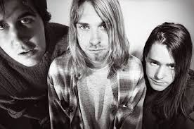
Having decided on my song choice, I began researching into existing bands which represented my chosen genre, so as to gain a clear insight into the typical artist style and consequently the style of video I wanted to create. "Where Is My Mind" by the Pixies falls into the category of "alternative rock", and so I looked to bands such as Nirvana, Radiohead and The Flaming Lips when deciding how to style my band. I then focused solely on the Pixies and having studied their music videos, came across a camcorder effect used in
one of their latest videos "Indie Cindy" which I then incorporated in my own work.


As well as this, the song's constant references to fish directed me to Green Day's "Basket Case" video, which uses the motif of fish to enhance the inner turmoil of someone who is not in their right state of mind; the video demonstrates this as the fish swim around the artists' heads as a look of bewilderment appears on their faces.Upon editing a first draft, however, I decided to scrap the idea of blending the two shots together as the effect looked faded and took away from the abstract colourfulness of the fish footage, and so instead I edited the shots separately.

In order to develop ideas regarding digipak designs, I researched into a variety of existing products by a number of different artists within my chosen genre. I quickly recognised that they were all abstract in design and most colour palettes used were very psychedelic and bold. In most cases, the covers did not display images of the band, but instead featured surreal, eye-catching illustrations which did not bear much relevance to the music. With this in mind, I decided to build on the psychedelic element in my video and use stills of the fish to create a colourful digipak with interesting connotations, which would hopefully draw my target audience's attention to the album. I took influences from Nirvana's Incesticide artwork, which used an image of a giant rubber duck on the back cover, replacing this with an image of a fish. I then created a similar layout when adding the text, as well as using a similar font to reflect the genre. I chose which song titles to use based on other albums by bands such as Radiohead, Pink Floyd and The Breeders. The idea of the fish also bears relation to the surf rock genre which adheres to the Pixies' style and therefore Electric Addiction's.

When creating my magazine advert, I once again researched others of the same genre to get a feel for a typical layout. Most, regardless of genre, featured the front cover of the album artwork in the centre or extended the image to fit the entire page. In keeping with this idea, I placed the front panel of my digipak on a blank page and developed my ideas from there. I looked through several music magazines and newspapers and found one particular advert for the "Coared EP" by Cheetahs, which placed the album cover near the top of the page and added further information below. I adapted this layout in my own work, placing text just below the image on the right hand side and further down on the left hand side with space in between, drawing the eye to both pieces of text. To ensure that the advert did not look cluttered and to hold the audience's attention, I only included the vital information needed; the date of release, the album title, the record label logo and the band's web address, should the consumer wish to find out more. Another option would have been to withhold even more information and simply write a tagline such as "New Album Out Now", as I found on a "Mars Voltra" album advert; my research concluded that the less given away the better, as generally a lot of text would overwhelm the reader.


Monday, 2 December 2013
Evaluation Questions
1. In what ways does your media product use, develop or challenge forms and conventions of real media products?
2. How effective is the combination of your main product and ancillary texts?
3. What have you learned from your audience feedback?
4. How did you use media technologies in the construction and research, planning and evaluation stages?
2. How effective is the combination of your main product and ancillary texts?
3. What have you learned from your audience feedback?
4. How did you use media technologies in the construction and research, planning and evaluation stages?
Wednesday, 13 November 2013
Location Alterations
Having received feedback that the studio setting was not right, due to the cheap wallpaper and poor lighting, I have decided to re-shoot in a different room. The "White" room and the "Target" room are a lot better in terms of mise-en-scene. Both have plain, white walls which will not distract from the band and provide a clean background for the shoot. The black flooring in the Target Room contrasts with the walls, creating a monochrome colour palette and a more professional-looking backdrop. The drums are of better quality and are elevated for emphasis, making the set-up of the band look a lot more realistic. Similarly, the White Room would also serve the purpose of creating a simplistic backdrop to work with. Once again, the rooms come equipped with a drum-set, microphones and stands, and amps. The lighting in both rooms, as you can see from the images, is much better than in the Orange Room, as the spotlights are white and placed evenly along the ceilings. The fact that the rooms both have white walls means that I can focus on the band without there being any distractions in the background, ie. coloured wallpaper, and I have the option of enhancing the background colour if I wish.
The White Room


The Target Room


The White Room
The Target Room
Monday, 11 November 2013
Video Feedback
- Not overly keen on the walking in the countryside part (the rest is fine though)
- Drumming looks weak, considering how the drum kicks in with real force on the track. The drummer needs to look like they mean it.
- The bassist needs to lip sync the backing vocals in the studio shots.
- The bass player and drummer need to work on their playing. It needs to look more convincing.
- The mise-en-scene in the studio is awful but having watched the video several times it becomes strangely appealing.
- I love the shot at 1.57 - the look on the bassist's face is brilliant
- The fish shots are great. Shame they couldn't feature earlier too.
- Level 3
I received the following feedback from my teacher, and due to this, I will organise a re-shoot at the studio, switch rooms, and inform the bass player and drummer of what they need to do to improve the impact of the video. I may also alter my storyboard and incorporate some more fish shots nearer the beginning of the video, as well as improving the 'walking in the countryside' part and changing the shot, then also re-filming outside.
Sunday, 3 November 2013
Digipak Draft - Spine Improvements

I have unaltered the text on the spine, as this font matched the tracklistings on the back cover and allow the audience to identify the album, but added the CAD number to further enhance the professionalism of the overall effect, as seen on the Daughter - If You Leave cover.

Digipak Draft - Inside Left Improvements

Firstly, I moved the text "Produced and mixed by Gil Norton" from the previous back cover and placed it on the inside left. However, afterwards I researched into other 4AD CD covers and found that most had further tracking information on the inside cover, and so I decided to recreate this. I added a paragraph of text below the image, as shown above, which included the year the record was produced, who it was produced by, who it was written by, who was in charge of art direction and design, and who photographed the images. This extra detail makes the overall effect seem a lot more professional, as the details added portray real legal information.
Friday, 1 November 2013
Monday, 28 October 2013
Digipak Draft - Back Cover Improvements
Firstly, I moved the tracklistings slightly further down and then to the right. The original placing of the text looked off-center and some words were lost in front of the splashes of red in the background. I then removed the barcode because it didn't look like it belonged to 4AD. I removed the text which was below the record label's logo, "Produced and mixed by Gil Norton" and replaced the barcode with another which had been found on a album produced by 4AD. I placed the 4AD logo underneath and added some product legal information above. This made the cover look neater and more professional, and now directs the eye to the important information in the corner which is now in one place.
Magazine Advert - Draft Improvements

Friday, 18 October 2013
Magazine Advert
I decided that I wanted to include the album cover on my magazine advert, as I had seen this done previously and thought that this was the best way to promote the album. With this in mind, I pasted the cover onto a plain document in Photoshop.

I then placed a tagline underneath, stating the release date of the album as I felt this was essential information to include.

As the album is untitled on the front cover, I felt that it was necessary to include the band name and the album title below, and so placed them in the bottom left hand corner to draw the eye away from the other text on the page but also to it.

I then added the band's "website" address below this, as I had seen it done on other adverts, and to add an extra professional touch. The "consumer" could then check the website to find out more information about the band's album release.

Finally, I added the "4AD" logo, as this would suggest what kind of music the album was to have on it, and also because the label are responsible for the music itself and so needed recognition. I didn't feel that the advert needed anything else added to it, as the space below the image allows for the few pieces of text to really stand out; also, the audience might be put off by a lot of writing as this would take away from the important information. A fan of the band would automatically know what the advert was promoting, and someone who was unaware of the band but was interested by the cover would seek to find out more information (such as single releases) if necessary.

Digipak Design
Whilst designing my Digipak, I decided that it would be a good idea to use stills from some of the previous footage I had shot, and planned to manipulate my "tropical fish" idea into the making of the digipak as well as my music video. The fish reflect elements of surf rock and are also relevant to my album single "Where Is My Mind?". Also, the effects I used on my iPhone during filming made the footage look abstract and would add a psychedelic element to my work without much further editing.
First of all, I took a screen shot of the still I wanted to work with and pasted it into a Microsoft Word document and saved it as an image.

I then opened the image in Paint and cropped it down.

Having done this, the image was then ready to be placed into Photoshop.

(Before I did so, I imported a 4 panel digipak template so as to make the designing process much easier.)

I then did the same for the back cover.

After that, I began adding details to the back cover, starting with the tracklistings.

I then pasted a barcode onto the cover (this particular barcode I found had been used on several of the Pixies' albums).

I added two final details, and wrote "Produced and mixed by Gil Norton", who produced several of the Pixies' albums...

...and then added the "4AD" logo, symbolising the British independent record label, to create a sense of professionalism and realism about my work.
4AD sign alternative rock, indie rock and post-punk bands to their label, such as Pixies, The Breeders and Throwing Muses, and are therefore perfectly associated with "Electric Addiction".
I then filled in the spine of the cover,

and added the album title and band name to it; "Electric Addiction - "Pipeline Pop Jet".

I wanted to use four different fish in my artwork, and so took stills from different sections of my footage. I didn't like the colours used when I cropped this image of a clown fish, however, and so decided to edit this on Photoshop.

I played around with the hue/saturation, and changed the colour balance/exposure etc. until I was happy with the result.

I decided on a bright green background, in keeping with the colour scheme of the two other images, and blended the lighter colours in the image to counter-balance the black, as I felt that this created a more psychedelic look.

I then did the same with a final image, although keeping a bit of black within the colour scheme this time to make the fish stand out against the light background.

And this is the final result!
Subscribe to:
Posts (Atom)