Nirvana - Incesticide

The colour scheme used on the album cover is particularly important in attracting the target audience. The cover uses a pale green background to reflect the genre of the music and the grunge style of the band. The cover uses a Z layout and first draws attention to the band's name in the top left hand corner, which is black and bold, and looks as if it has been cut out and pasted onto the cover. The eye then casts over the abstract images in the centre of the cover and rests on the roses which are the most colourful. The album title uses the same red but is slightly lighter, and is placed in the bottom right hand corner of the cover, completing the Z layout. This piece of text forms the third layer of the cover, as it has been placed over the images in the centre, which has also been placed over the background along with the band name; this creates a 3D effect and makes the art seem less important than the album title, although it is less visible to the audience than the band's name. The art bears no relation to the music or the band itself, but was painted by the band's vocalist Kurt Cobain. The ambiguous nature of the cover image interests the consumer and proceeds to attract them to pick up the CD and look over the front and back covers.
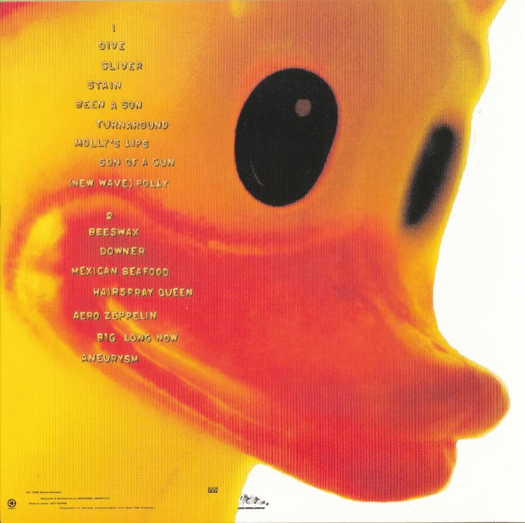
The rubber duck seen on the album's back cover belonged to Cobain but is also very ambiguous as there is no relationship between it and the front cover or the artist, making the consumer want to find out more and listen to the music.

No comments:
Post a Comment