Monday 28 October 2013

Digipak Draft - Back Cover Improvements


Firstly, I moved the tracklistings slightly further down and then to the right. The original placing of the text looked off-center and some words were lost in front of the splashes of red in the background. I then removed the barcode because it didn't look like it belonged to 4AD. I removed the text which was below the record label's logo, "Produced and mixed by Gil Norton" and replaced the barcode with another which had been found on a album produced by 4AD. I placed the 4AD logo underneath and added some product legal information above. This made the cover look neater and more professional, and now directs the eye to the important information in the corner which is now in one place.

Magazine Advert - Draft Improvements


I have made a few changes to my draft magazine advert, so as to neaten it up and improve the overall effect. I have changed the date, from the 6th to the 2nd, as release days are usually on Mondays. This tiny detail is not exceptionally important but adds to the overall professionalism of the piece. As well as this, I moved the rest of the text down a little to close up the space at the bottom of the page, and made sure the web address was in line with the 4AD symbol. Overall the advert looks a lot tidier, just by adding a few tweaks.

Friday 18 October 2013

Magazine Advert

I decided that I wanted to include the album cover on my magazine advert, as I had seen this done previously and thought that this was the best way to promote the album. With this in mind, I pasted the cover onto a plain document in Photoshop.


I then placed a tagline underneath, stating the release date of the album as I felt this was essential information to include.


As the album is untitled on the front cover, I felt that it was necessary to include the band name and the album title below, and so placed them in the bottom left hand corner to draw the eye away from the other text on the page but also to it.


I then added the band's "website" address below this, as I had seen it done on other adverts, and to add an extra professional touch. The "consumer" could then check the website to find out more information about the band's album release.


Finally, I added the "4AD" logo, as this would suggest what kind of music the album was to have on it, and also because the label are responsible for the music itself and so needed recognition. I didn't feel that the advert needed anything else added to it, as the space below the image allows for the few pieces of text to really stand out; also, the audience might be put off by a lot of writing as this would take away from the important information. A fan of the band would automatically know what the advert was promoting, and someone who was unaware of the band but was interested by the cover would seek to find out more information (such as single releases) if necessary.

Digipak Design

Whilst designing my Digipak, I decided that it would be a good idea to use stills from some of the previous footage I had shot, and planned to manipulate my "tropical fish" idea into the making of the digipak as well as my music video. The fish reflect elements of surf rock and are also relevant to my album single "Where Is My Mind?". Also, the effects I used on my iPhone during filming made the footage look abstract and would add a psychedelic element to my work without much further editing.

First of all, I took a screen shot of the still I wanted to work with and pasted it into a Microsoft Word document and saved it as an image.

                                     
 I then opened the image in Paint and cropped it down. 


Having done this, the image was then ready to be placed into Photoshop.


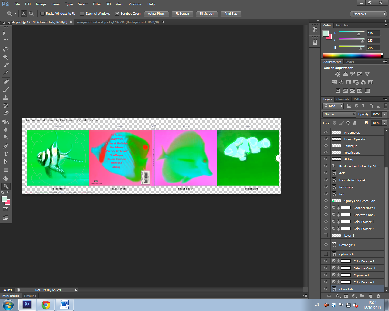
(Before I did so, I imported a 4 panel digipak template so as to make the designing process much easier.)


I then did the same for the back cover.


After that, I began adding details to the back cover, starting with the tracklistings.


I then pasted a barcode onto the cover (this particular barcode I found had been used on several of the Pixies' albums).


I added two final details, and wrote "Produced and mixed by Gil Norton", who produced several of the Pixies' albums...


...and then added the "4AD" logo, symbolising the British independent record label, to create a sense of professionalism and realism about my work.
4AD sign alternative rock, indie rock and post-punk bands to their label, such as Pixies, The Breeders and Throwing Muses, and are therefore perfectly associated with "Electric Addiction".


I then filled in the spine of the cover,


and added the album title and band name to it; "Electric Addiction - "Pipeline Pop Jet".


I wanted to use four different fish in my artwork, and so took stills from different sections of my footage. I didn't like the colours used when I cropped this image of a clown fish, however, and so decided to edit this on Photoshop.


I played around with the hue/saturation, and changed the colour balance/exposure etc. until I was happy with the result.


I decided on a bright green background, in keeping with the colour scheme of the two other images, and blended the lighter colours in the image to counter-balance the black, as I felt that this created a more psychedelic look.


I then did the same with a final image, although keeping a bit of black within the colour scheme this time to make the fish stand out against the light background.


And this is the final result!

Digipak / Magazine Advert Draft


Thursday 17 October 2013

Filming 16/10/13

My second time filming at the studio went much smoother than first. I booked the Orange Room from 5 until 7, as I knew an hour was not enough time to organise myself. The extra hour meant that I could set up the equipment and the camera without rushing, as well as having time to re-shoot footage which I wasn't sure about and being able to experiment once I was used to my surroundings. I made sure that my actors were comfortable in their positions and brought along a docking station so I could play "Where Is My Mind" out-loud and the actors would be able to play in time to the song. I knew that one of my actors had to leave at 6:30, and so shot all of the footage which required him to be present before this time.
The whole process was a lot more relaxed and I got a lot more done because of it. I finished early and so was able to experiment with different shots of the drummer, and filmed from different angles and at different parts of the song.
One thing which could hinder the quality of my filming, however, was the lighting in the room. The only light was hung, as you can see in the images, not in the middle but to the side of the ceiling. It only occurred to me whilst I came to a close that I could use the flash on my camera, and so most of my footage I shot may well be a little dark and need to be enhanced during the editing process. Overall, though, the experience was much better than last time and I was able to capture everything I had set out to.


Monday 14 October 2013

Filming 13/10/13

The filming which took place in Leire was much more beneficial than my previous experience, and I think I managed to capture everything I needed for my draft video.
I filmed on a Sunday, which meant that we could shoot for the entire afternoon until it got dark, and as the location was outside and in a public place, it was free of charge. I could re-shoot entire scenes without the constant pressure of a time limit, which was a great relief.
My actors brought their guitars/bass etc. to the location and were dressed accordingly. The fact that we were outside and were continuously moving around meant that we couldn't bring a drumkit with us, but I brought along a set of drumsticks for the drummer (replaced by another actor who was more accustomed to playing the instrument) to carry around with him. Stemborough Lane was a great place to shoot because the path turned off and led to a field which was overlooked by a lake, and we were almost completely uninterrupted by passers-by. This meant that there was plenty of room to film and also a variation of scenery.
I used a Samsung camcorder when shooting, as this created the shoddy, homemade style I wanted to capture. However, the downside to this is that a camcorder works using a tape, and therefore cannot be imported to a computer as easily as footage from a video camera can be.  If I cannot find a way to transfer the footage to a disc, I will have to re-record the shots on my video camera, using the camcorder's LCD screen, as I don't think re-recording the shots themselves using a video camera would look as good. There was a black and white setting on the camcorder which I used, as I had originally planned to incorporate a monochrome palette within my video, and also because this made the footage look more grungy and would be easier to work with when editing and adding effects.
I was able to shoot everything I wanted to, but I may decide to change and re-shoot some shots.
Here is a sample of my favourite shot. I played the footage on the LCD screen, rewinded and re-recorded it using my iPhone.


I wanted to test out some effects using my iPhone, and so also shot some footage using the app "Video Star". My favourite shot is the double effect which is applied to the final actor.

The Best Opening Credits Ever

From the film "Scott Pilgrim VS. The World". I like the variation of performance shots, and the editing and effects which have been used.

Saturday 12 October 2013

Filming 10/10/13

Admittedly, filming at the studio on Wednesday did not go too well.
As previously stated, I had booked the Orange Room from 5 until 6, and so arrived beforehand to set up. However, upon arrival, I had to find missing cymbals, sort out which shots I needed to focus on and become accustomed to using the video camera I had borrowed from college at the last minute, as I couldn't use the camera I had originally planned to. I was unorganised and it showed in the quality of my footage.
One of my actors was late getting to the studio, and was then scheduled to play the drums, but wasn't very strong in that area musically, which messed up a lot of the shots and wasted time. By the time any proper filming could take place, the hour was almost up. I didn't want to waste the opportunity and so asked if it was possible to stay an extra hour, but someone had already booked out the Orange Room from 6 o'clock. However, I was able to use the Blue Room, and so decided to move into there. This wasted more time, however, as we had to move all of the equipment into another room and set up once again, and obviously the room was a different colour, therefore creating inconsistency within the shots.
Another of my actors had to leave half an hour later, limiting what I could do within the short amount of extra time I was given, and the shots which were good in terms of camerawork were once again ruined due to the drummer not looking comfortable.
Overall, there is very little footage, if none, which can be saved and used from this experience, and therefore I have re-booked the studio for the 16th, as I was pleased with the location.

Friday 11 October 2013

Advert Analysis


This advert is the most minimalistic of the three I have analysed, but is effective because of the contrast between the monochrome palette and the splashes of colour. The advert is not overcrowded with text, drawing the eye to the few vital pieces of information included, and focusing on the album cover at the top of the page. The black and white artwork is made to stand out against the dash of pink in the background. The album cover itself is simple in its design; the artist name and the album name are placed over a grey-scale photograph of waves breaking on a rock. The pink text used on the album cover is repeated on the advert, in keeping with the colour scheme, advertising the release date of the album and the release show date only. I like the layout of this advert, and intend to base my own advert, similarly, on the album artwork.

Wednesday 9 October 2013

Advert Analysis


This advert was also found in Mojo magazine. Once again, this advert is quite colourful, and contrasts a rich orange with a deep green. The artwork is reflective of the album cover, bearing no relation to the music but attracting the audience to the advert and the album. 
I don't particularly like the way the text has been placed over the background, as it obscures the audience's view of the artwork and makes the advert look too busy, although the light yellow does stand out from the darker colours underneath. The name of the band is written in dark purple and stands out against the orange background, but the album title is larger on the page and is a lighter colour, therefore insinuating that this is the most important piece of information and drawing the eye firstly to this. 
The block of text includes more information than that of the previous advert, stating the release date of the album, availability and featured singles. As before, web addresses are present on the advert for extra information about the band. The lack of variation in the text font and size, as well as the layout, however, subtracts from the information which is being retained by the audience, as it looks like it is quite a lot to read at first glance. 
At the very bottom of the page there are ratings from critically acclaimed magazines, thus boosting the album's reputation and persuading the audience to purchase the product. 

Advert Analysis


The first thing to attract my attention to this advert was the psychedelic colour palette; there is scarcely any text, allowing the audience to focus solely on the important information - the album title, the name of the band, the headline "New Album Out Now" and where to buy. The audience is directed to the product information and is shown where to purchase the product from, without being distracted by unnecessary text cluttering up the background.
The colour of the text has been chosen so it is bold against the colourful background. The name of the band is written in white, whereas the album title is black; this establishes a clear distinction between the two and makes the other stand out. The album title and the name of the band are equal in size, suggesting that they are equally as important.
The album cover is displayed in the middle of the advert, and is separated from the background due to the white border, which is simply a continuation of the artwork. The eye is automatically drawn to the centre, because of this. The advert is almost split in half due to the contrast in colours. The red/orange is bright and first attracts the eye to the album information; the darker blue/purple then catches the audience's attention and draws the eye to the header and the web addresses. By including the Amazon logo, rather than just placing the text in a similar way to the other address, the audience knows from first glance where they can purchase the album from and is drawn to the black box surrounding the address.

Album Adverts


Tuesday 8 October 2013

Filming Schedule

Thursday, 10th October:
Stayfree Music Studios, Leicester


I have booked the Orange Room at Stayfree Music Studios from 5 until 6, where I will be filming performance shots of the band. I will be bringing along an electric guitar and a bass guitar, and have informed the persons involved with what to wear.
The following equipment is supplied:
Behringher PA
Epiphone head and cab
Fender Guitar Combo
Peavey MKIII head and cab
Drumkit with Pearl fittings
2 Microphones and stands

Sunday, 13th October:
Stemborough Lane, Leire

Digipak Analysis

Pink Floyd - Relics

The golden spiral theory has been applied to this album cover, as the eye is first drawn to the header in the left hand corner and then spirals down and across over the image. The album title and the band name are placed next to each other, suggesting that they are of equal importance. The colour scheme is very dark, but is contrasted by the light blue text, thus making the important information stand out. The original art (above, right) was designed by drummer Nick Mason, and was inspired by his time studying architecture. However, Storm Thorgerson created a new cover (above, left) for the 1996 re-release, photographing a model inspired by the original line drawing. Neither bear any relation to the band or the album, once again, but are very eye-catching and abstract in their design, attracting the target audience to the music.

The back cover (right) relating to the newer artwork is very similar to the front cover, in that it uses the same colour scheme and images, although the blues are intensified slightly and the image of the model has been scaled down. The way the barcode has been positioned is slightly odd, as it is on its side and looks quite out of place.

Pink Floyd - Relics DigiPack CDThe digipak artwork (left) repeats the cover image throughout, although sometimes capturing the model from a different angle and changing the effects added (the panel on the left is darker than the others and looks slightly grey, whereas the panel on the right has a black border and the image is gold). The colour scheme is primarily blue, black and gold, although the booklet is a richer purple on some pages, reflecting elements of psychedelia and grunge.

I have found different back covers belonging to the original drawn artwork (below), each of which are incredible minimalistic and bare, sticking to a plain, black and white colour scheme and abandoning the previous outburst of colour used in the pink header. This may have been done to let the music speak for itself, but I much prefer the newer artwork which is much more colourful and attractive.


    I also found this version of the album artwork (below), which is slightly different in colour to the original but is in keeping with the drawn architectural style. The bold font style is more closely related to the newer artwork, however, and stands out against the grubby, dull looking background. The song titles fill half of the space on the back cover, suggesting that this is the most important information for the audience to receive.


Monday 7 October 2013

Digipak Analysis

Nirvana - Incesticide

The colour scheme used on the album cover is particularly important in attracting the target audience. The cover uses a pale green background to reflect the genre of the music and the grunge style of the band. The cover uses a Z layout and first draws attention to the band's name in the top left hand corner, which is black and bold, and looks as if it has been cut out and pasted onto the cover. The eye then casts over the abstract images in the centre of the cover and rests on the roses which are the most colourful. The album title uses the same red but is slightly lighter, and is placed in the bottom right hand corner of the cover, completing the Z layout. This piece of text forms the third layer of the cover, as it has been placed over the images in the centre, which has also been placed over the background along with the band name; this creates a 3D effect and makes the art seem less important than the album title, although it is less visible to the audience than the band's name. The art bears no relation to the music or the band itself, but was painted by the band's vocalist Kurt Cobain. The ambiguous nature of the cover image interests the consumer and proceeds to attract them to pick up the CD and look over the front and back covers.


The rubber duck seen on the album's back cover belonged to Cobain but is also very ambiguous as there is no relationship between it and the front cover or the artist, making the consumer want to find out more and listen to the music.

Sunday 6 October 2013

Digipak Analysis

Radiohead - OK Computer

The album cover uses a white background and black text so as to contrast each other, as well as making the colourful artwork stand out. The images used on the front cover are blurred and distorted, creating a sense of disorientation, reflecting the style of music and the context of the songs (for example "Paranoid Android"). The album's artwork is a collage of images and text, credited under the pseydonym "The White Chocolate Farm". The colour palette is predominantly white and blue, the result of "trying to make something the colour of bleached bone", according to Stanley Donwood, the creator. Visual motifs include motorways, aeroplanes, families, corporate logos and cityscapes. Phrases in the constructed language Esperanto and health-related instructions in both English and Greek appear in the booklet artwork, and the words "Lost Child" feature prominently on the cover. Several phrases bearing no relation to one another which appear throughout, and the white scribbles used as a way of correcting mistakes, suggest an irrational mind is behind the concepts. The title of the album itself is "to do with standing in a room where all these appliances are going off and all these machines and computers and so on ... and the sound it makes", once again illustrating the nonsensical theme running throughout. The liner notes contain the full lyrics which are arranged in shapes that resemble hidden images and are rendered with atypical syntax, alternate spelling and small annotations. The headers (the title of the album and the band's name) are placed underneath each other, in the top right hand corner of the cover. The title has been made bigger than the band's name, therefore insinuating that this is the most important piece of information.


The above image is a page from the CD booklet and features the motif of two stick figures shaking hands, which is also repeated twice in the artwork and once on the compact disc itself, and is emblematic of exploitation. The page also features white scribbles and text in Esperanto and English.

Other pages:


Radiohead are an experimental rock band and therefore, are not associated with the norm. From this we can assume that fans of the band will be attracted to the unforeseeable and will want to see the boundaries being pushed. This is reflected in the OK Computer album artwork, due to its abstract and surreal design, which will in turn attract the band's target audience to the album.
I would like to incorporate some of the blurred, distorted effects used in the OK Computer artwork into my own work, as well as using similar colours and similar styled images, as I think the bright blues contrast well with the white background and the black figures, creating a very psychedelic effect.