
In what ways does your media product use, develop or challenge forms and conventions of real media products?
Having decided on my song choice, I began researching into existing bands which represented my chosen genre, so as to gain a clear insight into the typical artist style and consequently the style of video I wanted to create. "Where Is My Mind" by the Pixies falls into the category of "alternative rock", and so I looked to bands such as Nirvana, Radiohead and The Flaming Lips when deciding how to style my band. I then focused solely on the Pixies and having studied their music videos, came across a camcorder effect used in
one of their latest videos "Indie Cindy" which I then incorporated in my own work.


As well as this, the song's constant references to fish directed me to Green Day's "Basket Case" video, which uses the motif of fish to enhance the inner turmoil of someone who is not in their right state of mind; the video demonstrates this as the fish swim around the artists' heads as a look of bewilderment appears on their faces.Upon editing a first draft, however, I decided to scrap the idea of blending the two shots together as the effect looked faded and took away from the abstract colourfulness of the fish footage, and so instead I edited the shots separately.

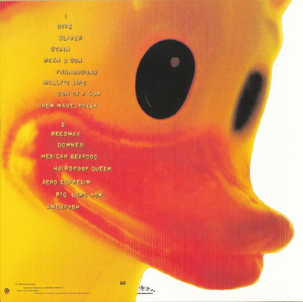
In order to develop ideas regarding digipak designs, I researched into a variety of existing products by a number of different artists within my chosen genre. I quickly recognised that they were all abstract in design and most colour palettes used were very psychedelic and bold. In most cases, the covers did not display images of the band, but instead featured surreal, eye-catching illustrations which did not bear much relevance to the music. With this in mind, I decided to build on the psychedelic element in my video and use stills of the fish to create a colourful digipak with interesting connotations, which would hopefully draw my target audience's attention to the album. I took influences from Nirvana's Incesticide artwork, which used an image of a giant rubber duck on the back cover, replacing this with an image of a fish. I then created a similar layout when adding the text, as well as using a similar font to reflect the genre. I chose which song titles to use based on other albums by bands such as Radiohead, Pink Floyd and The Breeders. The idea of the fish also bears relation to the surf rock genre which adheres to the Pixies' style and therefore Electric Addiction's.

When creating my magazine advert, I once again researched others of the same genre to get a feel for a typical layout. Most, regardless of genre, featured the front cover of the album artwork in the centre or extended the image to fit the entire page. In keeping with this idea, I placed the front panel of my digipak on a blank page and developed my ideas from there. I looked through several music magazines and newspapers and found one particular advert for the "Coared EP" by Cheetahs, which placed the album cover near the top of the page and added further information below. I adapted this layout in my own work, placing text just below the image on the right hand side and further down on the left hand side with space in between, drawing the eye to both pieces of text. To ensure that the advert did not look cluttered and to hold the audience's attention, I only included the vital information needed; the date of release, the album title, the record label logo and the band's web address, should the consumer wish to find out more. Another option would have been to withhold even more information and simply write a tagline such as "New Album Out Now", as I found on a "Mars Voltra" album advert; my research concluded that the less given away the better, as generally a lot of text would overwhelm the reader.


An effective response. Make sure you illustrate it with the examples referred to in the text.
ReplyDelete