
A2 Media
Showing posts with label research. Show all posts
Showing posts with label research. Show all posts
Monday, 16 December 2013

Friday, 6 December 2013
Evaluation Question 4 (Draft)
How did you use media technologies in the construction and research, planning and evaluation stages?
During the research and planning stages of the project, the use of technologies, such as the internet, was vital in establishing a clear target audience, finding example texts and gaining inspiration. Without access to the following technologies, the construction process would have also been virtually impossible; not only was the recording equipment a necessity, but the editing software available also acted as a crucial component in the creation of both my main product and the ancillary texts.
YouTube
Access to the internet, and YouTube in particular, helped shape my ideas during the research and planning stages. I began my research by scouring the site for music videos of all genres, so as to gain an insight into the typical conventions used, and then narrowed down the search to alternative rock videos only. I copied the embed codes of the videos I found the most interesting, and captured specific shots using TubeChop which I then pasted into blog posts that I could refer back to during further planning. I also presented my music video in the form of a YouTube upload, as this provided a professional platform to display my work, as well as making my product easily accessible to an audience, through YouTube itself, and by pasting the link into social networking sites and into Blogger to gain feedback.
Blogger
I used Blogger throughout the entirety of the project as a way of tracking my progress and projecting my ideas, whilst gaining feedback in the process and presenting my final products. As previously stated, the HTML section allows the user to embed codes from YouTube which then appear in video format when published, post Scribd documents or simply add text and images through the use of the "compose" tool. Comment boxes are present on each post, thus encouraging audience feedback, and I was also able to embed the band's Twitter feed directly onto the blog itself.
Twitter
I created a Twitter profile for "Electric Addiction" so as to further promote my artist and establish a clear brand name. Twitter was important during the establishment of Electric Addiction's identity, as I was able to directly reach an audience and further portray elements of branding, such as "retweeting" bands of a similar style and genre onto my profile and uploading pictures during my time in the studio - I was able to use the Twitter app to post photos directly from my iPhone, as well as being able to "tweet" whenever I wanted. The platform allowed me to post links which would appear on my followers' timelines, and so by sharing my final video via Twitter, I gained more views and received extra audience feedback.
Animoto
I briefly used Animoto during the planning stages of my work, and used it as a way of visually representing my initial ideas during the construction of my pitch to the class. I was able to add audio to a short presentation consisting of both text and images, which allowed my peers to get a feel for the genre of music I was focusing on, as well as determining whether the style of visuals would work well alongside my chosen song.
Samsung VP-L800U Camcorder
By using the Samsung VP-L800U Camcorder, I was able to create a grainy, noise effect without spending extra time editing the footage. I filmed using the black and white filter which was installed on the camcorder, and then played back the footage and viewed it on the LCD screen. The bulky size but lightweight feel of the camera made filming a lot easier, as I was able to hold and move the camera with both sturdiness and ease.
The downside to using the Samsung was that I couldn't transfer the footage to the iMacs or simply one of the computers. It was impossible to upload the video footage because there were no videos, simply recordings on a tape. I could have converted the tape footage to a disc, but this would have been costly and time-consuming, and so to overcome this problem, I re-shot the footage on the LCD screen using a Panasonic digital camcorder, which could then be transferred onto the iMac. The Panasonic was a useful piece of equipment as I could film each shot separately, gaining individual pieces of footage rather than one continuous shot, as was the case with the Samsung, which played each shot directly after the previous one. I used the tape to my advantage, however; by re-winding and pausing the footage whilst re-filming with the Panasonic, I was able to capture the full effects of an old camcorder whilst viewing the footage on the LCD screen. The new footage shot using the Panasonic displayed the recording time in the corner of the screen and captured the white noise effect of rewinding.
Panasonic HDC-SC80 Full HD Video Camera
The Panasonic digital camcorder I used was a vital piece of equipment during the construction process of my music video, as it captured all of the footage I shot and enabled me to upload this footage to the iMac, which I then edited using Final Cut Pro. The handheld size of the camera meant that I could easily shoot in any location and could create a shaky camera effect easily as it was lightweight and subject to my own movement, rather than being placed still on a tripod for example. The Panasonic enabled me to view each shot separately, thus helping me to distinguish between the good and bad footage before uploading, increasing productivity during the filming process. Both camcorders allowed me to zoom in and out effectively, focusing and framing the shot, and enabled me to add digital effects whilst filming. As well as being able to view the footage whilst it was being shot on the LCD screens, I could also use the flash on the Panasonic to capture well-lit footage regardless of exterior lighting. All in all, this camcorder took a lot of the pressure off my shoulders and allowed for great filming.
Final Cut Pro/Apple iMac
The Final Cut Pro software available on the iMacs at college was essential during the editing process of my music video. Although I had trouble connecting and uploading the footage I had shot using the Samsung camcorder, this problem was easily overcome as I re-shot my footage from the camcorder LCD screen using the Panasonic; I was then able to transfer all of my footage, from both the video camera and the camcorder (though taken also from the Panasonic), to one specific area. I could then view each shot before placing them accordingly in the video timeline, as well as being able to crop the footage to the length I wanted. The programme also allowed me to insert audio clips, and so I was able to place "Where Is My Mind" directly onto the timeline and have it play alongside the footage, thus allowing me to ensure that the lip syncing and performance was timed correctly, and that the visuals reflected the music. Final Cut Pro also enabled me to add a number of digital effects and transitions to my footage, creating smooth cuts between shots and establishing a professional look. The "static" transition, for example, was a recurring effect used throughout my video, as well as the "camcorder" effect which enhanced the aesthetic I'd already created using my own camcorder. The software became a vital editing tool whilst trying to achieve the final 30 seconds (more or less) of my video; in processing my storyboard, I had planned to incorporate a juxtaposition of a mirrored shot and a shot of the vocalist miming, constantly going back and forth and switching between the two, increasing the pace of the editing considerably. Final Cut Pro made the whole process a lot easier; each piece of footage was at hand as they were imported to the software's library, and I was able to use the "zoom" tool to perfectly match up each shot, making each cut precise and seeming to follow on from one another although there was a glitch in between. Prior to this, I used Final Cut Pro to create my animatic; a visual representation of my storyboard presented as a video, with each shot edited in time with the song.
iPhone/Video Star
During the filming process, I not only used camcorders, but also my iPhone, and specifically the app "Video Star". This footage is included towards the end of my video, and was used to further emphasise a state of disorientation as the song reaches its climax. The app allowed me to use a mirror effect which both reflected the image and enhanced the colour saturation, creating a psychedelic and surreal style. Having captured the footage, I was able to upload straight to YouTube from my iPhone. I then pasted the link into Blogger so as to gain audience feedback and present my work, and transferred this onto Final Cut Pro by accessing the link on the iMacs. I also used my iPhone to promote my artist, as previously stated, by uploading photos using the Twitter app.
Adobe Photoshop
I used Adobe Photoshop during the production of my ancillary texts. The editing software allowed me to create a design for my digipak, and, consequently, a magazine advert. First of all, I imported a digipak template into a blank document, thus setting up the outline for my design. I then viewed my "test shots" video and took screen grabs of certain shots I wanted to incorporate into my digipak. I saved them as pictures and imported them into Photoshop, within the guidelines of the template. Photoshop provided me with access to cropping tools and enabled me to add effects to the graphics, as well as altering the exposure, colour balance and hue/saturation, further enhancing the element of psychedelia throughout my work. Having used Photoshop during the AS course, I had previous knowledge of the programme and decided that it would be the best editing software to use in the construction of my ancillary texts. By creating different layers, both text and images are easy to place and edit, and can also be hidden if need be or deleted altogether without affecting the remaining layers. Having completed the digipak, I then began working on the magazine advert; I created a new document and imported the digipak front cover into the blank space, then added text using the "type" tool. All of the tools available, such as the "grid" tool, proved to be beneficial during the editing process - in this instance, the grid tool allowed me to align text and images, and helped me to establish rules of third and general space awareness. Without the use of this technology, my completed products would not look to such a high standard, and the professionalism of my work would be lost.
During the research and planning stages of the project, the use of technologies, such as the internet, was vital in establishing a clear target audience, finding example texts and gaining inspiration. Without access to the following technologies, the construction process would have also been virtually impossible; not only was the recording equipment a necessity, but the editing software available also acted as a crucial component in the creation of both my main product and the ancillary texts.
YouTube
Access to the internet, and YouTube in particular, helped shape my ideas during the research and planning stages. I began my research by scouring the site for music videos of all genres, so as to gain an insight into the typical conventions used, and then narrowed down the search to alternative rock videos only. I copied the embed codes of the videos I found the most interesting, and captured specific shots using TubeChop which I then pasted into blog posts that I could refer back to during further planning. I also presented my music video in the form of a YouTube upload, as this provided a professional platform to display my work, as well as making my product easily accessible to an audience, through YouTube itself, and by pasting the link into social networking sites and into Blogger to gain feedback.
Blogger
I used Blogger throughout the entirety of the project as a way of tracking my progress and projecting my ideas, whilst gaining feedback in the process and presenting my final products. As previously stated, the HTML section allows the user to embed codes from YouTube which then appear in video format when published, post Scribd documents or simply add text and images through the use of the "compose" tool. Comment boxes are present on each post, thus encouraging audience feedback, and I was also able to embed the band's Twitter feed directly onto the blog itself.
I created a Twitter profile for "Electric Addiction" so as to further promote my artist and establish a clear brand name. Twitter was important during the establishment of Electric Addiction's identity, as I was able to directly reach an audience and further portray elements of branding, such as "retweeting" bands of a similar style and genre onto my profile and uploading pictures during my time in the studio - I was able to use the Twitter app to post photos directly from my iPhone, as well as being able to "tweet" whenever I wanted. The platform allowed me to post links which would appear on my followers' timelines, and so by sharing my final video via Twitter, I gained more views and received extra audience feedback.
Animoto
I briefly used Animoto during the planning stages of my work, and used it as a way of visually representing my initial ideas during the construction of my pitch to the class. I was able to add audio to a short presentation consisting of both text and images, which allowed my peers to get a feel for the genre of music I was focusing on, as well as determining whether the style of visuals would work well alongside my chosen song.
Samsung VP-L800U Camcorder
By using the Samsung VP-L800U Camcorder, I was able to create a grainy, noise effect without spending extra time editing the footage. I filmed using the black and white filter which was installed on the camcorder, and then played back the footage and viewed it on the LCD screen. The bulky size but lightweight feel of the camera made filming a lot easier, as I was able to hold and move the camera with both sturdiness and ease.
The downside to using the Samsung was that I couldn't transfer the footage to the iMacs or simply one of the computers. It was impossible to upload the video footage because there were no videos, simply recordings on a tape. I could have converted the tape footage to a disc, but this would have been costly and time-consuming, and so to overcome this problem, I re-shot the footage on the LCD screen using a Panasonic digital camcorder, which could then be transferred onto the iMac. The Panasonic was a useful piece of equipment as I could film each shot separately, gaining individual pieces of footage rather than one continuous shot, as was the case with the Samsung, which played each shot directly after the previous one. I used the tape to my advantage, however; by re-winding and pausing the footage whilst re-filming with the Panasonic, I was able to capture the full effects of an old camcorder whilst viewing the footage on the LCD screen. The new footage shot using the Panasonic displayed the recording time in the corner of the screen and captured the white noise effect of rewinding.
Panasonic HDC-SC80 Full HD Video Camera
The Panasonic digital camcorder I used was a vital piece of equipment during the construction process of my music video, as it captured all of the footage I shot and enabled me to upload this footage to the iMac, which I then edited using Final Cut Pro. The handheld size of the camera meant that I could easily shoot in any location and could create a shaky camera effect easily as it was lightweight and subject to my own movement, rather than being placed still on a tripod for example. The Panasonic enabled me to view each shot separately, thus helping me to distinguish between the good and bad footage before uploading, increasing productivity during the filming process. Both camcorders allowed me to zoom in and out effectively, focusing and framing the shot, and enabled me to add digital effects whilst filming. As well as being able to view the footage whilst it was being shot on the LCD screens, I could also use the flash on the Panasonic to capture well-lit footage regardless of exterior lighting. All in all, this camcorder took a lot of the pressure off my shoulders and allowed for great filming.
Final Cut Pro/Apple iMac
The Final Cut Pro software available on the iMacs at college was essential during the editing process of my music video. Although I had trouble connecting and uploading the footage I had shot using the Samsung camcorder, this problem was easily overcome as I re-shot my footage from the camcorder LCD screen using the Panasonic; I was then able to transfer all of my footage, from both the video camera and the camcorder (though taken also from the Panasonic), to one specific area. I could then view each shot before placing them accordingly in the video timeline, as well as being able to crop the footage to the length I wanted. The programme also allowed me to insert audio clips, and so I was able to place "Where Is My Mind" directly onto the timeline and have it play alongside the footage, thus allowing me to ensure that the lip syncing and performance was timed correctly, and that the visuals reflected the music. Final Cut Pro also enabled me to add a number of digital effects and transitions to my footage, creating smooth cuts between shots and establishing a professional look. The "static" transition, for example, was a recurring effect used throughout my video, as well as the "camcorder" effect which enhanced the aesthetic I'd already created using my own camcorder. The software became a vital editing tool whilst trying to achieve the final 30 seconds (more or less) of my video; in processing my storyboard, I had planned to incorporate a juxtaposition of a mirrored shot and a shot of the vocalist miming, constantly going back and forth and switching between the two, increasing the pace of the editing considerably. Final Cut Pro made the whole process a lot easier; each piece of footage was at hand as they were imported to the software's library, and I was able to use the "zoom" tool to perfectly match up each shot, making each cut precise and seeming to follow on from one another although there was a glitch in between. Prior to this, I used Final Cut Pro to create my animatic; a visual representation of my storyboard presented as a video, with each shot edited in time with the song.
iPhone/Video Star
During the filming process, I not only used camcorders, but also my iPhone, and specifically the app "Video Star". This footage is included towards the end of my video, and was used to further emphasise a state of disorientation as the song reaches its climax. The app allowed me to use a mirror effect which both reflected the image and enhanced the colour saturation, creating a psychedelic and surreal style. Having captured the footage, I was able to upload straight to YouTube from my iPhone. I then pasted the link into Blogger so as to gain audience feedback and present my work, and transferred this onto Final Cut Pro by accessing the link on the iMacs. I also used my iPhone to promote my artist, as previously stated, by uploading photos using the Twitter app.
Adobe Photoshop
I used Adobe Photoshop during the production of my ancillary texts. The editing software allowed me to create a design for my digipak, and, consequently, a magazine advert. First of all, I imported a digipak template into a blank document, thus setting up the outline for my design. I then viewed my "test shots" video and took screen grabs of certain shots I wanted to incorporate into my digipak. I saved them as pictures and imported them into Photoshop, within the guidelines of the template. Photoshop provided me with access to cropping tools and enabled me to add effects to the graphics, as well as altering the exposure, colour balance and hue/saturation, further enhancing the element of psychedelia throughout my work. Having used Photoshop during the AS course, I had previous knowledge of the programme and decided that it would be the best editing software to use in the construction of my ancillary texts. By creating different layers, both text and images are easy to place and edit, and can also be hidden if need be or deleted altogether without affecting the remaining layers. Having completed the digipak, I then began working on the magazine advert; I created a new document and imported the digipak front cover into the blank space, then added text using the "type" tool. All of the tools available, such as the "grid" tool, proved to be beneficial during the editing process - in this instance, the grid tool allowed me to align text and images, and helped me to establish rules of third and general space awareness. Without the use of this technology, my completed products would not look to such a high standard, and the professionalism of my work would be lost.
Monday, 2 December 2013
Evaluation Questions
1. In what ways does your media product use, develop or challenge forms and conventions of real media products?
2. How effective is the combination of your main product and ancillary texts?
3. What have you learned from your audience feedback?
4. How did you use media technologies in the construction and research, planning and evaluation stages?
2. How effective is the combination of your main product and ancillary texts?
3. What have you learned from your audience feedback?
4. How did you use media technologies in the construction and research, planning and evaluation stages?
Friday, 11 October 2013
Advert Analysis

This advert is the most minimalistic of the three I have analysed, but is effective because of the contrast between the monochrome palette and the splashes of colour. The advert is not overcrowded with text, drawing the eye to the few vital pieces of information included, and focusing on the album cover at the top of the page. The black and white artwork is made to stand out against the dash of pink in the background. The album cover itself is simple in its design; the artist name and the album name are placed over a grey-scale photograph of waves breaking on a rock. The pink text used on the album cover is repeated on the advert, in keeping with the colour scheme, advertising the release date of the album and the release show date only. I like the layout of this advert, and intend to base my own advert, similarly, on the album artwork.
Wednesday, 9 October 2013
Advert Analysis

This advert was also found in Mojo magazine. Once again, this advert is quite colourful, and contrasts a rich orange with a deep green. The artwork is reflective of the album cover, bearing no relation to the music but attracting the audience to the advert and the album.
I don't particularly like the way the text has been placed over the background, as it obscures the audience's view of the artwork and makes the advert look too busy, although the light yellow does stand out from the darker colours underneath. The name of the band is written in dark purple and stands out against the orange background, but the album title is larger on the page and is a lighter colour, therefore insinuating that this is the most important piece of information and drawing the eye firstly to this.
The block of text includes more information than that of the previous advert, stating the release date of the album, availability and featured singles. As before, web addresses are present on the advert for extra information about the band. The lack of variation in the text font and size, as well as the layout, however, subtracts from the information which is being retained by the audience, as it looks like it is quite a lot to read at first glance.
At the very bottom of the page there are ratings from critically acclaimed magazines, thus boosting the album's reputation and persuading the audience to purchase the product.
Advert Analysis

The first thing to attract my attention to this advert was the psychedelic colour palette; there is scarcely any text, allowing the audience to focus solely on the important information - the album title, the name of the band, the headline "New Album Out Now" and where to buy. The audience is directed to the product information and is shown where to purchase the product from, without being distracted by unnecessary text cluttering up the background.
The colour of the text has been chosen so it is bold against the colourful background. The name of the band is written in white, whereas the album title is black; this establishes a clear distinction between the two and makes the other stand out. The album title and the name of the band are equal in size, suggesting that they are equally as important.
The album cover is displayed in the middle of the advert, and is separated from the background due to the white border, which is simply a continuation of the artwork. The eye is automatically drawn to the centre, because of this. The advert is almost split in half due to the contrast in colours. The red/orange is bright and first attracts the eye to the album information; the darker blue/purple then catches the audience's attention and draws the eye to the header and the web addresses. By including the Amazon logo, rather than just placing the text in a similar way to the other address, the audience knows from first glance where they can purchase the album from and is drawn to the black box surrounding the address.


Tuesday, 8 October 2013
Digipak Analysis
Pink Floyd - Relics

 The golden spiral theory has been applied to this album cover, as the eye is first drawn to the header in the left hand corner and then spirals down and across over the image. The album title and the band name are placed next to each other, suggesting that they are of equal importance. The colour scheme is very dark, but is contrasted by the light blue text, thus making the important information stand out. The original art (above, right) was designed by drummer Nick Mason, and was inspired by his time studying architecture. However, Storm Thorgerson created a new cover (above, left) for the 1996 re-release, photographing a model inspired by the original line drawing. Neither bear any relation to the band or the album, once again, but are very eye-catching and abstract in their design, attracting the target audience to the music.

The back cover (right) relating to the newer artwork is very similar to the front cover, in that it uses the same colour scheme and images, although the blues are intensified slightly and the image of the model has been scaled down. The way the barcode has been positioned is slightly odd, as it is on its side and looks quite out of place.
 The digipak artwork (left) repeats the cover image throughout, although sometimes capturing the model from a different angle and changing the effects added (the panel on the left is darker than the others and looks slightly grey, whereas the panel on the right has a black border and the image is gold). The colour scheme is primarily blue, black and gold, although the booklet is a richer purple on some pages, reflecting elements of psychedelia and grunge.
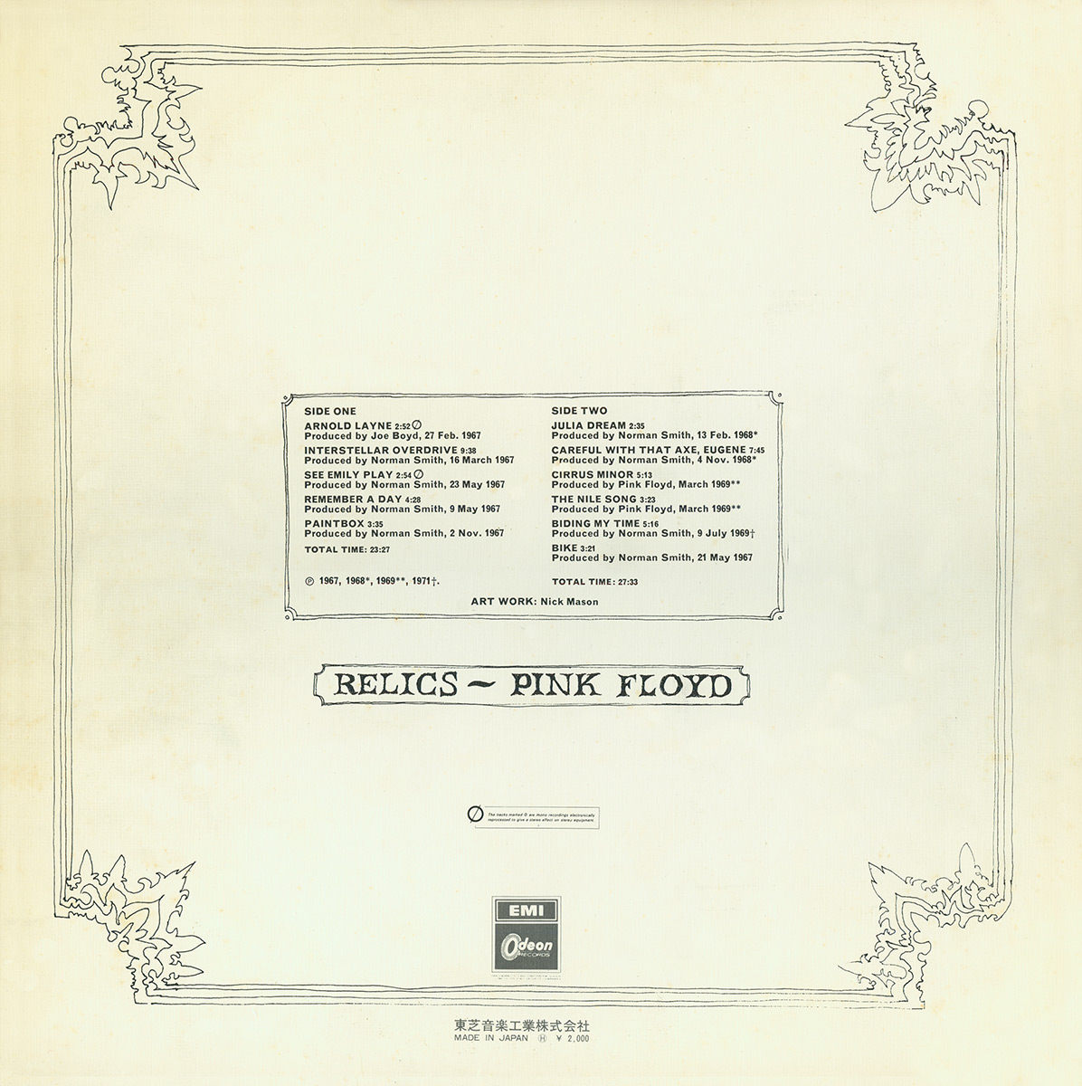
I have found different back covers belonging to the original drawn artwork (below), each of which are incredible minimalistic and bare, sticking to a plain, black and white colour scheme and abandoning the previous outburst of colour used in the pink header. This may have been done to let the music speak for itself, but I much prefer the newer artwork which is much more colourful and attractive.
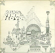
 The golden spiral theory has been applied to this album cover, as the eye is first drawn to the header in the left hand corner and then spirals down and across over the image. The album title and the band name are placed next to each other, suggesting that they are of equal importance. The colour scheme is very dark, but is contrasted by the light blue text, thus making the important information stand out. The original art (above, right) was designed by drummer Nick Mason, and was inspired by his time studying architecture. However, Storm Thorgerson created a new cover (above, left) for the 1996 re-release, photographing a model inspired by the original line drawing. Neither bear any relation to the band or the album, once again, but are very eye-catching and abstract in their design, attracting the target audience to the music.
The back cover (right) relating to the newer artwork is very similar to the front cover, in that it uses the same colour scheme and images, although the blues are intensified slightly and the image of the model has been scaled down. The way the barcode has been positioned is slightly odd, as it is on its side and looks quite out of place.
 The digipak artwork (left) repeats the cover image throughout, although sometimes capturing the model from a different angle and changing the effects added (the panel on the left is darker than the others and looks slightly grey, whereas the panel on the right has a black border and the image is gold). The colour scheme is primarily blue, black and gold, although the booklet is a richer purple on some pages, reflecting elements of psychedelia and grunge.
I have found different back covers belonging to the original drawn artwork (below), each of which are incredible minimalistic and bare, sticking to a plain, black and white colour scheme and abandoning the previous outburst of colour used in the pink header. This may have been done to let the music speak for itself, but I much prefer the newer artwork which is much more colourful and attractive.
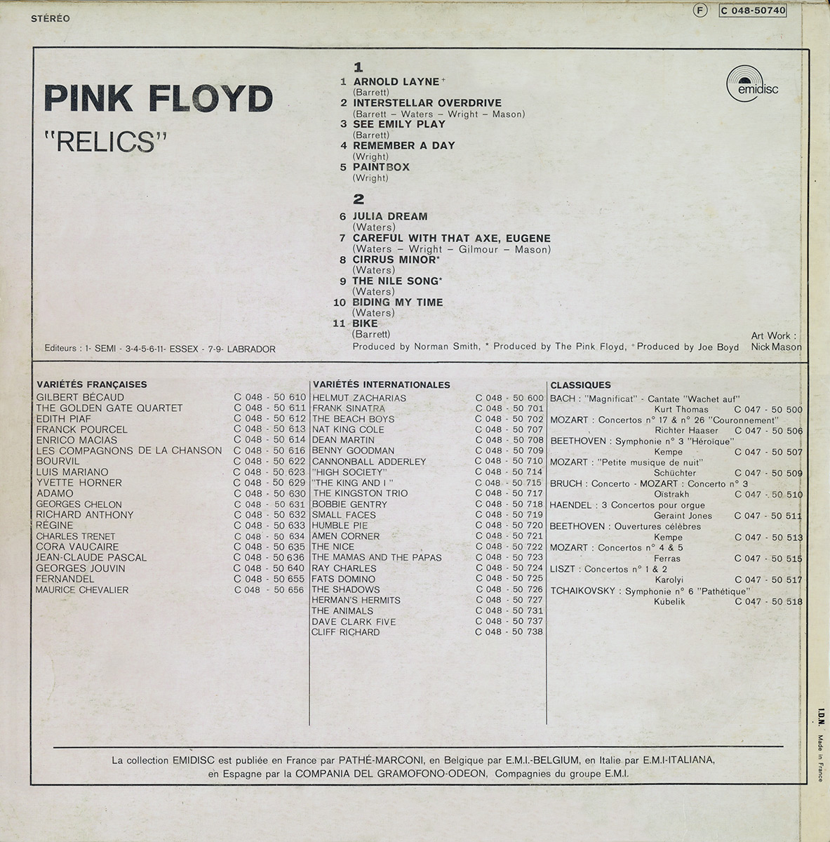
I also found this version of the album artwork (below), which is slightly different in colour to the original but is in keeping with the drawn architectural style. The bold font style is more closely related to the newer artwork, however, and stands out against the grubby, dull looking background. The song titles fill half of the space on the back cover, suggesting that this is the most important information for the audience to receive.


Monday, 7 October 2013
Digipak Analysis
Nirvana - Incesticide
 The colour scheme used on the album cover is particularly important in attracting the target audience. The cover uses a pale green background to reflect the genre of the music and the grunge style of the band. The cover uses a Z layout and first draws attention to the band's name in the top left hand corner, which is black and bold, and looks as if it has been cut out and pasted onto the cover. The eye then casts over the abstract images in the centre of the cover and rests on the roses which are the most colourful. The album title uses the same red but is slightly lighter, and is placed in the bottom right hand corner of the cover, completing the Z layout. This piece of text forms the third layer of the cover, as it has been placed over the images in the centre, which has also been placed over the background along with the band name; this creates a 3D effect and makes the art seem less important than the album title, although it is less visible to the audience than the band's name. The art bears no relation to the music or the band itself, but was painted by the band's vocalist Kurt Cobain. The ambiguous nature of the cover image interests the consumer and proceeds to attract them to pick up the CD and look over the front and back covers.

The rubber duck seen on the album's back cover belonged to Cobain but is also very ambiguous as there is no relationship between it and the front cover or the artist, making the consumer want to find out more and listen to the music.

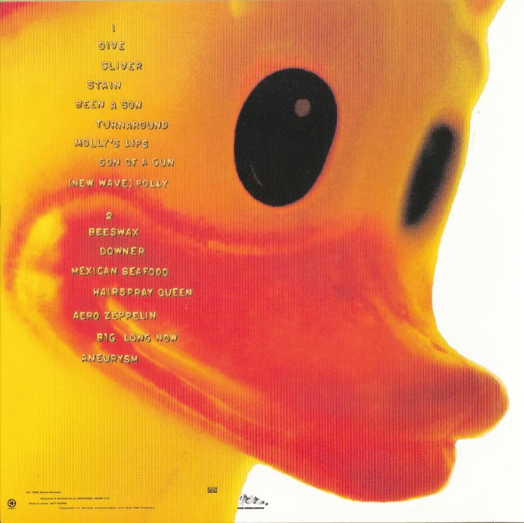
The rubber duck seen on the album's back cover belonged to Cobain but is also very ambiguous as there is no relationship between it and the front cover or the artist, making the consumer want to find out more and listen to the music.
Sunday, 6 October 2013
Digipak Analysis
Radiohead - OK Computer
 The album cover uses a white background and black text so as to contrast each other, as well as making the colourful artwork stand out. The images used on the front cover are blurred and distorted, creating a sense of disorientation, reflecting the style of music and the context of the songs (for example "Paranoid Android"). The album's artwork is a collage of images and text, credited under the pseydonym "The White Chocolate Farm". The colour palette is predominantly white and blue, the result of "trying to make something the colour of bleached bone", according to Stanley Donwood, the creator. Visual motifs include motorways, aeroplanes, families, corporate logos and cityscapes. Phrases in the constructed language Esperanto and health-related instructions in both English and Greek appear in the booklet artwork, and the words "Lost Child" feature prominently on the cover. Several phrases bearing no relation to one another which appear throughout, and the white scribbles used as a way of correcting mistakes, suggest an irrational mind is behind the concepts. The title of the album itself is "to do with standing in a room where all these appliances are going off and all these machines and computers and so on ... and the sound it makes", once again illustrating the nonsensical theme running throughout. The liner notes contain the full lyrics which are arranged in shapes that resemble hidden images and are rendered with atypical syntax, alternate spelling and small annotations. The headers (the title of the album and the band's name) are placed underneath each other, in the top right hand corner of the cover. The title has been made bigger than the band's name, therefore insinuating that this is the most important piece of information.

The above image is a page from the CD booklet and features the motif of two stick figures shaking hands, which is also repeated twice in the artwork and once on the compact disc itself, and is emblematic of exploitation. The page also features white scribbles and text in Esperanto and English.
Other pages:


Radiohead are an experimental rock band and therefore, are not associated with the norm. From this we can assume that fans of the band will be attracted to the unforeseeable and will want to see the boundaries being pushed. This is reflected in the OK Computer album artwork, due to its abstract and surreal design, which will in turn attract the band's target audience to the album.
I would like to incorporate some of the blurred, distorted effects used in the OK Computer artwork into my own work, as well as using similar colours and similar styled images, as I think the bright blues contrast well with the white background and the black figures, creating a very psychedelic effect.


The above image is a page from the CD booklet and features the motif of two stick figures shaking hands, which is also repeated twice in the artwork and once on the compact disc itself, and is emblematic of exploitation. The page also features white scribbles and text in Esperanto and English.
Other pages:

Radiohead are an experimental rock band and therefore, are not associated with the norm. From this we can assume that fans of the band will be attracted to the unforeseeable and will want to see the boundaries being pushed. This is reflected in the OK Computer album artwork, due to its abstract and surreal design, which will in turn attract the band's target audience to the album.
I would like to incorporate some of the blurred, distorted effects used in the OK Computer artwork into my own work, as well as using similar colours and similar styled images, as I think the bright blues contrast well with the white background and the black figures, creating a very psychedelic effect.
Thursday, 3 October 2013


Subscribe to:
Posts (Atom)