Showing posts with label digipak. Show all posts

Wednesday, 18 December 2013

Final Digipak


I did not alter the inside right image as my teacher had approved that this did not need changing, and although he did suggest that I add text to the front cover, I felt that this would ruin the image and after doing so, decided to leave it as it was originally. The back cover, inside left and spine improvements have been stated in previous posts.

Wednesday, 4 December 2013

Evaluation Question 2 (Draft)

How effective is the combination of your main product and your ancillary texts?

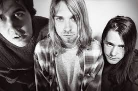
During the creation of both my main product and the ancillary texts, I kept in mind that I would need to successfully create a sense of branding throughout. Bands such as the Pixies, however, are generally known for their musical and lyrical style, rather than particularly bold appearances. In purposely trying to stay away from elaborately styling my artist, I ended up taking influences from grunge and alternative fashion, as worn by bands such as Nirvana, which are much more low-key and could even be considered as "scruffy" when compared to popular style trends of today. I felt that this would suit my artist a lot better given the genre of the music. With the absence of a memorable image, this meant that I needed to create a "brand" in a different way. Having researched into other psychedelic rock bands, such as Oingo Boingo and Pink Floyd, I concluded that I could instead use abstract artwork to attract an audience and associate with the band, rather than setting up a photoshoot for the digipak that would just not work.



In the early stages of pre-production, I decided that I would draw upon the references made to fish in "Where Is My Mind", and developed this idea by manipulating footage that I had shot specifically to enhance this element of the lyrics, which then became a recurring motif throughout my work. The effects used created a surreal image which was mirrored in the subject matter of the song, and the over-saturated colour palette further amplified the band's style - a mixture of indie rock, noise rock, psychedelic rock and surf rock. I decided to develop this element of psychedelia further, attempting to replicate and enhance the mind-altering experiences of psychedelic drugs, as I edited my music video, thus creating an effective brand to associate with "Electric Addiction". This is shown most significantly in the last minute of my video, as the pace of the editing quickens and creates a sense of disorientation as the video jumps from camcorder footage to shots which were heavily edited with added digital effects.


Having created a draft music video, I asked for some initial feedback, in which many of my peers commented on the fish element within my work. This became the most memorable part of my video, as the bold colours and abstract shapes of the fish juxtaposed with the black and white camcorder shots. I then decided that this general aesthetic could work well on the album cover, and so transferred stills from the video footage onto my digipak. During the creation of my magazine advert, I based the design entirely on the album cover, so as to establish a link between the two ancillary texts and consequently, further enhance the brand. Although most bands do not incorporate artwork designs within their videos and vice versa (though this is not always the case, and despite the genre, Arctic Monkeys' AM album artwork is present in the "Do I Wanna Know" video), I felt that this would establish a clear link between all of my products, creating a star image motif associated with the "Pipeline Pop Jet" album. Although this would change during other eras of the band's development, the fish motif would be associated with this phase of Electric Addiction's career nonetheless. This means that even those who are not necessarily fans of the band will still associate the images and themes with Electric Addiction. Alternatively, I could have looked to a black and white visual aesthetic, also present within the video, but I felt that this would not reflect the band's true essence; a monochrome palette would suggest to an audience that Electric Addiction were more stylised, and would confuse the appearance of the band with their offbeat musical style. Instead, I feel that the psychedelic element present throughout my work is a better representation of the band.

Monday, 2 December 2013

Evaluation Questions

1. In what ways does your media product use, develop or challenge forms and conventions of real media products?
2. How effective is the combination of your main product and ancillary texts?
3. What have you learned from your audience feedback?
4. How did you use media technologies in the construction and research, planning and evaluation stages?

Sunday, 3 November 2013

Digipak Draft - Spine Improvements


I have unaltered the text on the spine, as this font matched the tracklistings on the back cover and allow the audience to identify the album, but added the CAD number to further enhance the professionalism of the overall effect, as seen on the Daughter - If You Leave cover.


Digipak Draft - Inside Left Improvements


Firstly, I moved the text "Produced and mixed by Gil Norton" from the previous back cover and placed it on the inside left. However, afterwards I researched into other 4AD CD covers and found that most had further tracking information on the inside cover, and so I decided to recreate this. I added a paragraph of text below the image, as shown above, which included the year the record was produced, who it was produced by, who it was written by, who was in charge of art direction and design, and who photographed the images. This extra detail makes the overall effect seem a lot more professional, as the details added portray real legal information.

Monday, 28 October 2013

Digipak Draft - Back Cover Improvements


Firstly, I moved the tracklistings slightly further down and then to the right. The original placing of the text looked off-center and some words were lost in front of the splashes of red in the background. I then removed the barcode because it didn't look like it belonged to 4AD. I removed the text which was below the record label's logo, "Produced and mixed by Gil Norton" and replaced the barcode with another which had been found on a album produced by 4AD. I placed the 4AD logo underneath and added some product legal information above. This made the cover look neater and more professional, and now directs the eye to the important information in the corner which is now in one place.

Tuesday, 8 October 2013

Digipak Analysis

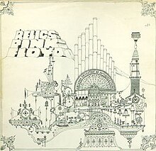
Pink Floyd - Relics

The golden spiral theory has been applied to this album cover, as the eye is first drawn to the header in the left hand corner and then spirals down and across over the image. The album title and the band name are placed next to each other, suggesting that they are of equal importance. The colour scheme is very dark, but is contrasted by the light blue text, thus making the important information stand out. The original art (above, right) was designed by drummer Nick Mason, and was inspired by his time studying architecture. However, Storm Thorgerson created a new cover (above, left) for the 1996 re-release, photographing a model inspired by the original line drawing. Neither bear any relation to the band or the album, once again, but are very eye-catching and abstract in their design, attracting the target audience to the music.

The back cover (right) relating to the newer artwork is very similar to the front cover, in that it uses the same colour scheme and images, although the blues are intensified slightly and the image of the model has been scaled down. The way the barcode has been positioned is slightly odd, as it is on its side and looks quite out of place.

Pink Floyd - Relics DigiPack CDThe digipak artwork (left) repeats the cover image throughout, although sometimes capturing the model from a different angle and changing the effects added (the panel on the left is darker than the others and looks slightly grey, whereas the panel on the right has a black border and the image is gold). The colour scheme is primarily blue, black and gold, although the booklet is a richer purple on some pages, reflecting elements of psychedelia and grunge.

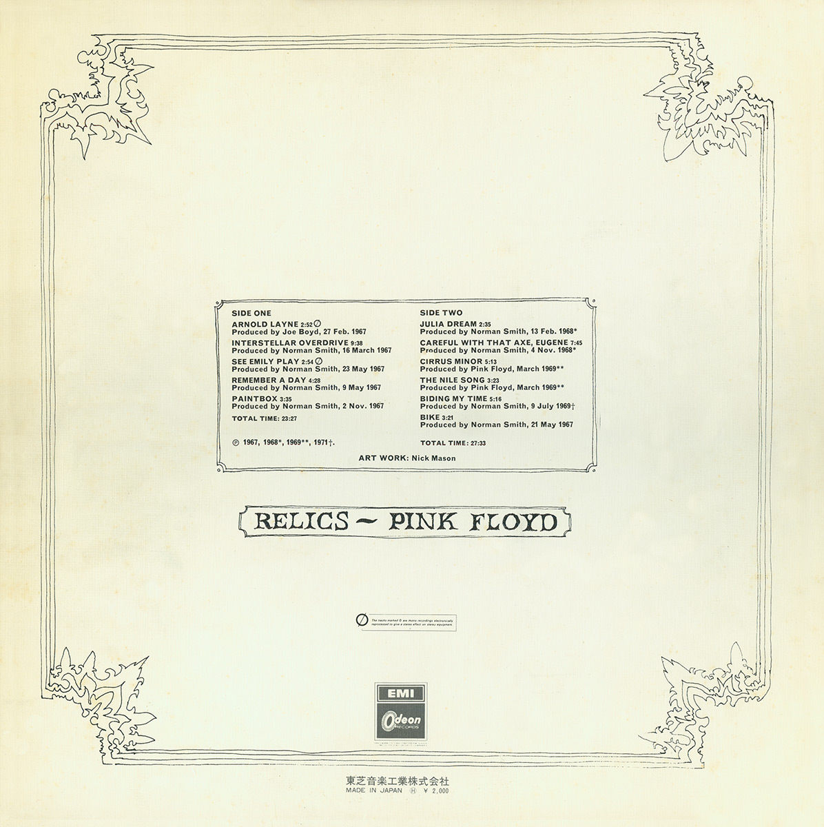
I have found different back covers belonging to the original drawn artwork (below), each of which are incredible minimalistic and bare, sticking to a plain, black and white colour scheme and abandoning the previous outburst of colour used in the pink header. This may have been done to let the music speak for itself, but I much prefer the newer artwork which is much more colourful and attractive.


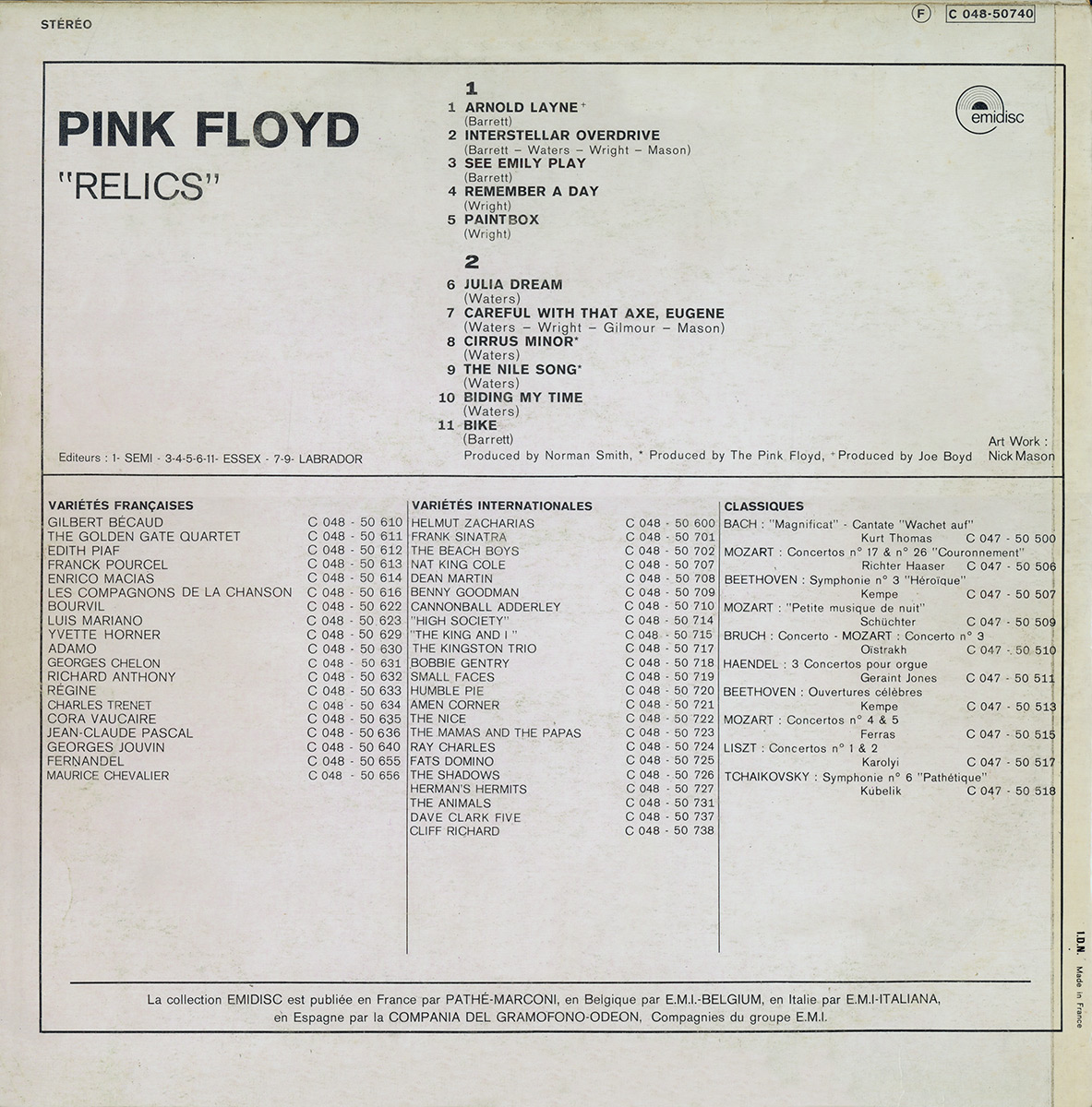
    I also found this version of the album artwork (below), which is slightly different in colour to the original but is in keeping with the drawn architectural style. The bold font style is more closely related to the newer artwork, however, and stands out against the grubby, dull looking background. The song titles fill half of the space on the back cover, suggesting that this is the most important information for the audience to receive.


Monday, 7 October 2013

Digipak Analysis

Nirvana - Incesticide

The colour scheme used on the album cover is particularly important in attracting the target audience. The cover uses a pale green background to reflect the genre of the music and the grunge style of the band. The cover uses a Z layout and first draws attention to the band's name in the top left hand corner, which is black and bold, and looks as if it has been cut out and pasted onto the cover. The eye then casts over the abstract images in the centre of the cover and rests on the roses which are the most colourful. The album title uses the same red but is slightly lighter, and is placed in the bottom right hand corner of the cover, completing the Z layout. This piece of text forms the third layer of the cover, as it has been placed over the images in the centre, which has also been placed over the background along with the band name; this creates a 3D effect and makes the art seem less important than the album title, although it is less visible to the audience than the band's name. The art bears no relation to the music or the band itself, but was painted by the band's vocalist Kurt Cobain. The ambiguous nature of the cover image interests the consumer and proceeds to attract them to pick up the CD and look over the front and back covers.


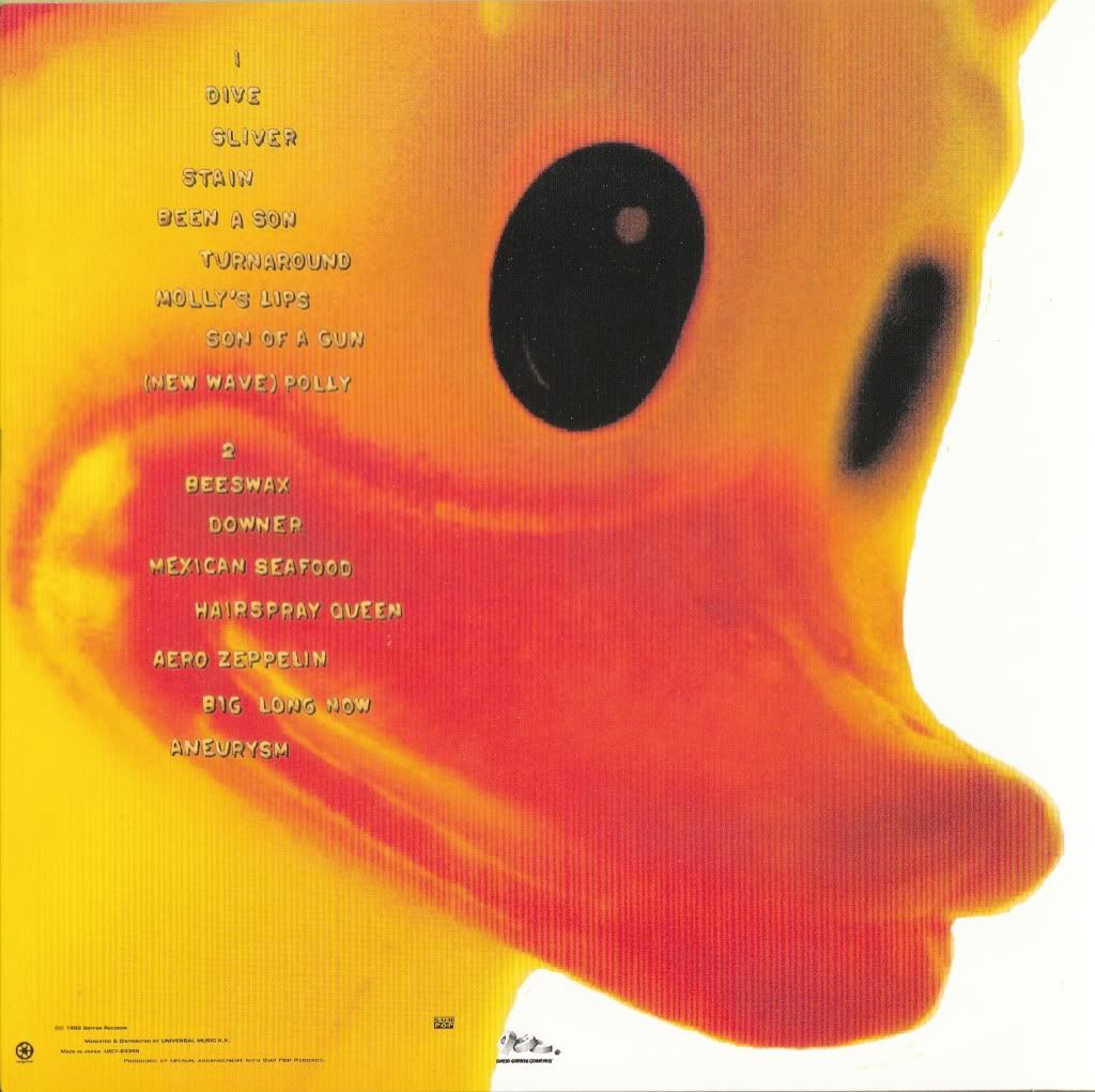
The rubber duck seen on the album's back cover belonged to Cobain but is also very ambiguous as there is no relationship between it and the front cover or the artist, making the consumer want to find out more and listen to the music.

Sunday, 6 October 2013

Digipak Analysis

Radiohead - OK Computer

The album cover uses a white background and black text so as to contrast each other, as well as making the colourful artwork stand out. The images used on the front cover are blurred and distorted, creating a sense of disorientation, reflecting the style of music and the context of the songs (for example "Paranoid Android"). The album's artwork is a collage of images and text, credited under the pseydonym "The White Chocolate Farm". The colour palette is predominantly white and blue, the result of "trying to make something the colour of bleached bone", according to Stanley Donwood, the creator. Visual motifs include motorways, aeroplanes, families, corporate logos and cityscapes. Phrases in the constructed language Esperanto and health-related instructions in both English and Greek appear in the booklet artwork, and the words "Lost Child" feature prominently on the cover. Several phrases bearing no relation to one another which appear throughout, and the white scribbles used as a way of correcting mistakes, suggest an irrational mind is behind the concepts. The title of the album itself is "to do with standing in a room where all these appliances are going off and all these machines and computers and so on ... and the sound it makes", once again illustrating the nonsensical theme running throughout. The liner notes contain the full lyrics which are arranged in shapes that resemble hidden images and are rendered with atypical syntax, alternate spelling and small annotations. The headers (the title of the album and the band's name) are placed underneath each other, in the top right hand corner of the cover. The title has been made bigger than the band's name, therefore insinuating that this is the most important piece of information.


The above image is a page from the CD booklet and features the motif of two stick figures shaking hands, which is also repeated twice in the artwork and once on the compact disc itself, and is emblematic of exploitation. The page also features white scribbles and text in Esperanto and English.

Other pages:


Radiohead are an experimental rock band and therefore, are not associated with the norm. From this we can assume that fans of the band will be attracted to the unforeseeable and will want to see the boundaries being pushed. This is reflected in the OK Computer album artwork, due to its abstract and surreal design, which will in turn attract the band's target audience to the album.
I would like to incorporate some of the blurred, distorted effects used in the OK Computer artwork into my own work, as well as using similar colours and similar styled images, as I think the bright blues contrast well with the white background and the black figures, creating a very psychedelic effect.