How effective is the combination of your main product and your ancillary texts?
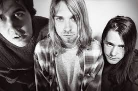
During the creation of both my main product and the ancillary texts, I kept in mind that I would need to successfully create a sense of branding throughout. Bands such as the Pixies, however, are generally known for their musical and lyrical style, rather than particularly bold appearances. In purposely trying to stay away from elaborately styling my artist, I ended up taking influences from grunge and alternative fashion, as worn by bands such as Nirvana, which are much more low-key and could even be considered as "scruffy" when compared to popular style trends of today. I felt that this would suit my artist a lot better given the genre of the music. With the absence of a memorable image, this meant that I needed to create a "brand" in a different way. Having researched into other psychedelic rock bands, such as Oingo Boingo and Pink Floyd, I concluded that I could instead use abstract artwork to attract an audience and associate with the band, rather than setting up a photoshoot for the digipak that would just not work.



In the early stages of pre-production, I decided that I would draw upon the references made to fish in "Where Is My Mind", and developed this idea by manipulating footage that I had shot specifically to enhance this element of the lyrics, which then became a recurring motif throughout my work. The effects used created a surreal image which was mirrored in the subject matter of the song, and the over-saturated colour palette further amplified the band's style - a mixture of indie rock, noise rock, psychedelic rock and surf rock. I decided to develop this element of psychedelia further, attempting to replicate and enhance the mind-altering experiences of psychedelic drugs, as I edited my music video, thus creating an effective brand to associate with "Electric Addiction". This is shown most significantly in the last minute of my video, as the pace of the editing quickens and creates a sense of disorientation as the video jumps from camcorder footage to shots which were heavily edited with added digital effects.
Having created a draft music video, I asked for some initial feedback, in which many of my peers commented on the fish element within my work. This became the most memorable part of my video, as the bold colours and abstract shapes of the fish juxtaposed with the black and white camcorder shots. I then decided that this general aesthetic could work well on the album cover, and so transferred stills from the video footage onto my digipak. During the creation of my magazine advert, I based the design entirely on the album cover, so as to establish a link between the two ancillary texts and consequently, further enhance the brand. Although most bands do not incorporate artwork designs within their videos and vice versa (though this is not always the case, and despite the genre, Arctic Monkeys' AM album artwork is present in the "Do I Wanna Know" video), I felt that this would establish a clear link between all of my products, creating a star image motif associated with the "Pipeline Pop Jet" album. Although this would change during other eras of the band's development, the fish motif would be associated with this phase of Electric Addiction's career nonetheless. This means that even those who are not necessarily fans of the band will still associate the images and themes with Electric Addiction. Alternatively, I could have looked to a black and white visual aesthetic, also present within the video, but I felt that this would not reflect the band's true essence; a monochrome palette would suggest to an audience that Electric Addiction were more stylised, and would confuse the appearance of the band with their offbeat musical style. Instead, I feel that the psychedelic element present throughout my work is a better representation of the band.


